Many Arabic brand identities look beautiful when they are first presented. Harmonious colors, a clean layout, attractive images and a distinctive typeface.
But before long, something starts to feel shaky. The identity does not last, does not take root and leaves no lasting impression.
The question here is not why it wasn’t beautiful, but why it wasn’t convincing.
🎭 Beauty is not the same as clarity
An identity can be visually appealing yet unclear in its message. When the typeface does not accurately reflect the brand personality, a subtle contradiction appears, one the audience can feel even if they cannot explain it.
A formal typeface for a friendly brand. A bold typeface for a project that needs calm. A very contemporary typeface for an identity built on traditional trust.
The contradiction is not always loud, but it gradually erodes trust.
🧩 Relying on trends instead of substance
Sometimes a designer gets swept along by a popular visual trend: a widely used typeface, a particular style, an eye-catching treatment.
But trends are often temporary, while an identity is long-term, though some designs may stay relevant after the wave recedes.
When an identity is built on a passing wave, it can lose its coherence as soon as the general trend shifts.
A strong identity does not chase fashion. It expresses an enduring essence.
⚖️ A strong typeface… in the wrong place
Some typefaces are genuinely excellent, but they do not suit every project.
A bold display typeface can be superb in an advertising campaign, but it overburdens an identity that uses it every day across many applications.
The problem is not the typeface but its misuse.
The right choice depends on context, not on the quality of the typeface alone.
📉 No typographic system
A beautiful identity with a good logo, but no clear system for headlines, text and visual hierarchy.
Without that system, the result is:
- Haphazard use
- Uneven weights
- A loss of consistency
An identity is not judged by a single image but by its ability to work across dozens of applications.
🔍 Ignoring the user experience
In digital environments especially, the typeface has to be legible on different screens, quick to read and visually stable.
If the typeface is beautiful but tiring to read, the identity fails functionally, even if it succeeds visually.
The experience matters more than the first impression.
🧠 A successful identity is not the loudest
Some identities try to stand out at any cost: lots of detail, a very strong presence, an extremely eye-catching typeface.
But excess can become a burden. A successful identity does not need to shout. It needs to be clear and balanced.
🖋️ At Iwan Type
We believe an identity is built not on momentary dazzle but on consistency, continuity and clarity.
The typeface in an identity does more than attract attention. It is a source of stability.
That is why we always ask: will this typeface still be right in five years?
If the answer is yes, we are most likely heading in the right direction.
🗂 From the collection
A selection from the Iwan Type collection:
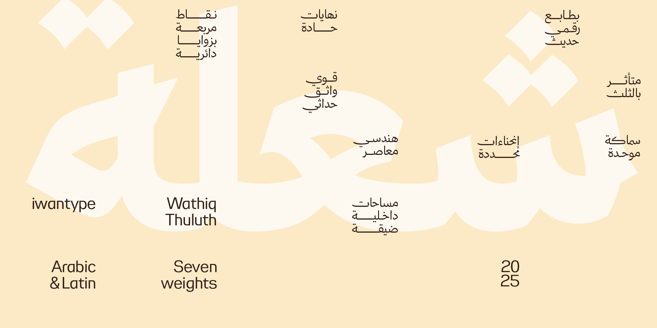
- Wathiq Thuluth — Naskh legibility with the grandeur of Thuluth compositions and extensions.
- Huwiya Display — a display typeface with generous counters and curves that lean toward the square.
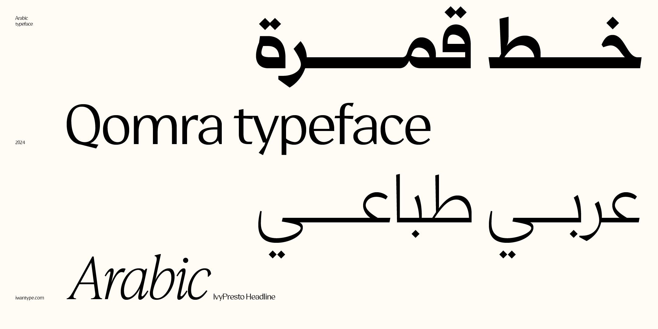
- Qomra — Mastari Naskh that combines simplicity and elegance, in five weights from Light to Black.
- Rayat — a strong structure with sharp angles and generous counters, in Arabic and Latin (Latin comes with the full family only).
To compare the license types and what each one covers, see commercial licenses for Arabic fonts.
❓ Frequently asked questions
Why do some Arabic brand identities fail despite their beauty?
Because beauty is not the same as clarity. An identity fails when its typeface is chosen for its looks alone, without testing how it works everywhere it will be used, or when there is no typographic system governing the relationship between headline and text.
What makes a brand identity’s typographic system work?
Graded weights that distinguish headline, text and detail; a typeface that works at both large and small sizes; and fixed rules applied across all materials.