


Visual comfort is no accident. Nor is it just a vague feeling that resists explanation.
There are clear reasons why one typeface is easy and comfortable to read, while another tires us after just a few lines.
A comfortable typeface does not draw attention to itself. It lets you focus on the meaning.
⚖️ Balanced stroke thickness
When the stroke thicknesses within a letter are balanced, the eye feels settled.
Very high contrast between thick and thin strokes can be beautiful, but it can be tiring in long texts.
Close, carefully judged stroke thicknesses, on the other hand, create a steady rhythm that is easy to follow.
Comfort begins with consistency.
🔤 Clear letterforms, no ambiguity
In Arabic, some letters look alike. If they are not designed clearly, the reader gets confused.
A comfortable typeface:
- Distinguishes between similar letters
- Keeps the dots clear
- Balances curves and angles
- Keeps visual masses from running into each other
The less confusion, the greater the comfort.
📏 Inner and outer spacing
The space inside a letter (the counter), the default spacing between glyphs (the sidebearings), the balance of the extensions…
All of these directly affect how comfortable a text feels.
A typeface that is too tightly spaced feels crowded. One spaced too loosely loses its cohesion.
A comfortable typeface breathes.
🔄 A regular rhythm
The eye tends to follow a regular pattern with ease.
When proportions, curves and stroke thicknesses repeat consistently, they form a visual rhythm that is easy to follow.
But if each letter differs sharply from the next, the text becomes tiring, because the eye has to readjust with every word.
Regularity does not mean monotony. It means stability.
🧩 Considered simplicity
Lots of detail can seem exciting at first, but it becomes tiring in extended reading.
A comfortable typeface is often:
- Simple in structure
- Clear in its details
- Restrained in its ornament
The goal is to convey meaning, not to show off skill.
🖥️ Suited to the medium
A typeface that is comfortable in print may not be comfortable on screen. Small screens need greater legibility, carefully judged stroke thickness and less intricate detail.
Comfort depends on the environment in which the typeface is used.
🧠 Why does it matter?
Because users do not notice a comfortable typeface, but they feel a jarring one straight away.
If readers grow tired, they may stop reading. And once they stop reading, the message loses its impact.
Comfort is not a luxury. It is a functional necessity.
🖋️ At Iwan Type
We consider visual comfort a fundamental part of a typeface’s quality. It is not enough for a typeface to be beautiful. It has to be stable, legible and readable for long stretches.
A good typeface does not draw attention to itself. It clears the way for the meaning.
🗂 From the collection
A selection from the Iwan Type collection:
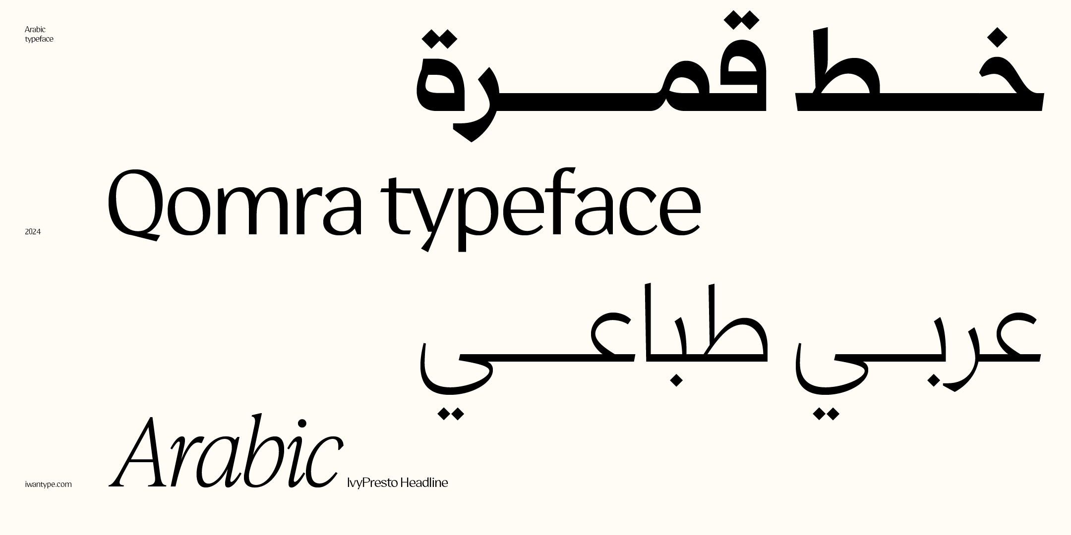
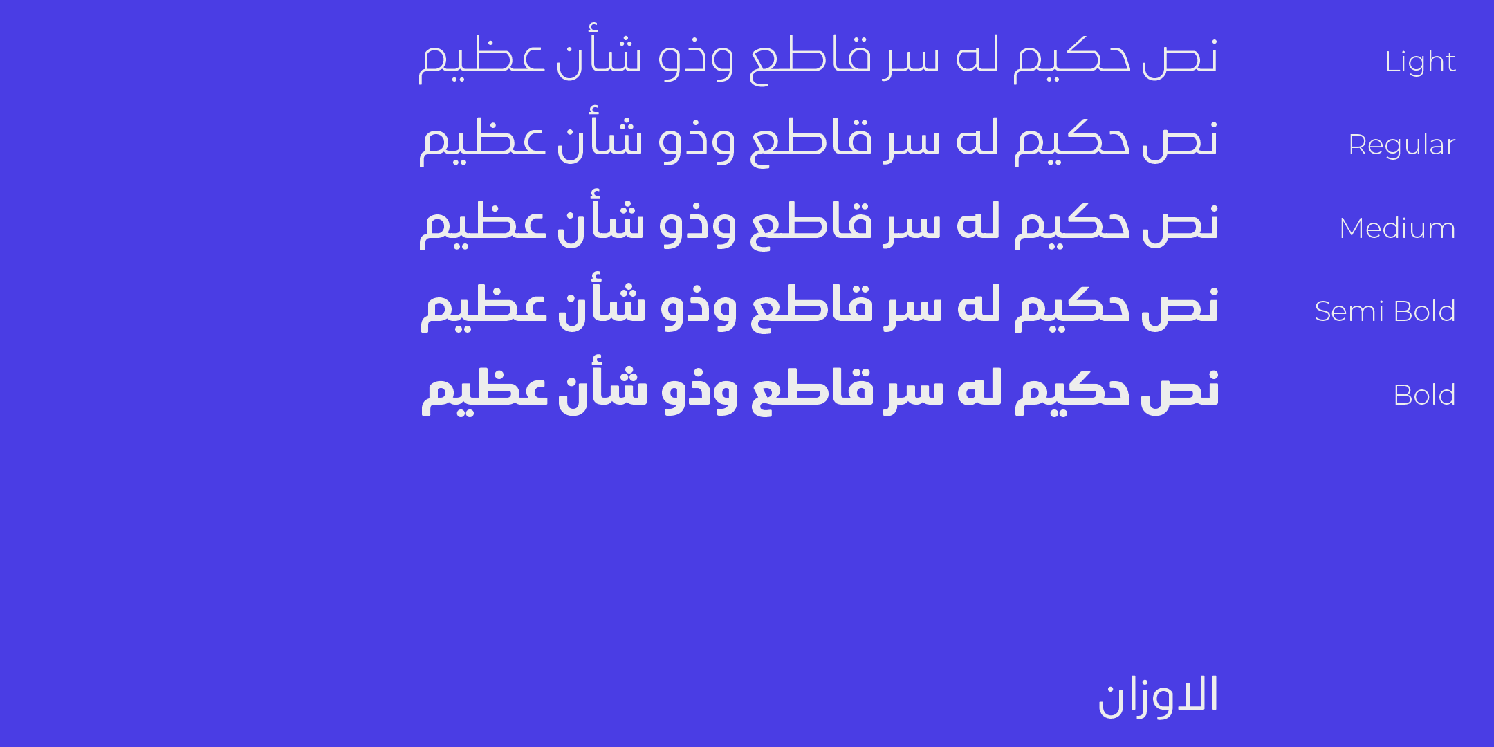
- Qomra — Mastari Naskh that combines simplicity and elegance, in five weights from Light to Black.
- Omnia Naskh — modern Naskh with deliberate simplicity and clean lines, in seven weights.
- Ruaq — considered simplicity and soft edges, in five weights.
- Rafiq — gravitas with warmth, and quiet details that are easy on the eye.
To compare the license types and what each one covers, see commercial licenses for Arabic fonts.
📐 What belongs to the typeface, and what belongs to typesetting
Before you hold the typeface responsible for all of the comfort, separate two things:
- Qualities of the typeface itself: balanced stroke thickness, clear letterforms, counters, the default spacing between glyphs and the overall rhythm.
- Typesetting and interface decisions: text size, line spacing, line length and column width, word spacing and contrast with the background.
The second group is not a property of the font file. These are decisions you make when you set the text, and their effect on reading comfort is no smaller than the typeface’s, and possibly greater. An excellent typeface set in very long lines with tight line spacing will look tiring, and the reverse is also true.
So when a reader complains that a text is tiring, check the typesetting first: it is quicker to adjust and has a broader effect.
❓ Frequently asked questions
What makes Arabic type comfortable to read?
Balanced stroke thickness, clear letterforms that do not confuse similar letters, well-judged inner and outer spacing, a regular rhythm that does not jump, and a typeface suited to the medium it will appear in.
Why do some typefaces tire the eye despite their beauty?
Because beauty at a large size does not mean comfort at a small one. High contrast and rich detail can turn into visual noise when they repeat across a whole paragraph.