


Luxury in type is not ornament. Confusing the two is the misunderstanding I see most often in premium brand projects: the client asks for a “luxurious” typeface, the designer comes back with something ornate and full of flourishes, and the result looks crowded rather than precious.
Real luxury is discipline before it is decoration: space that breathes, considered details and consistent use. This article explains what creates a sense of luxury and what spoils it, then closes with examples from the collection.
⚠️ What spoils the sense of luxury
Mixing more than two typefaces. Three typefaces in one identity often read as confusion rather than richness, unless the system gives each one a clear role.
Alternates everywhere. Most of the typefaces in the collection come with alternates and ligatures, Asal and Omnia Naskh among them. They are tools for chosen moments: the logo, the cover, the main headline. Use them in every word and the text turns into a performance.
A luxury typeface on cheap material. Type cannot rescue poor packaging or a low-quality photograph. Print is part of the feel, not decoration laid on top of it.
Too few weights. Without a light weight for details, you end up using the regular weight everywhere, and the system goes flat.
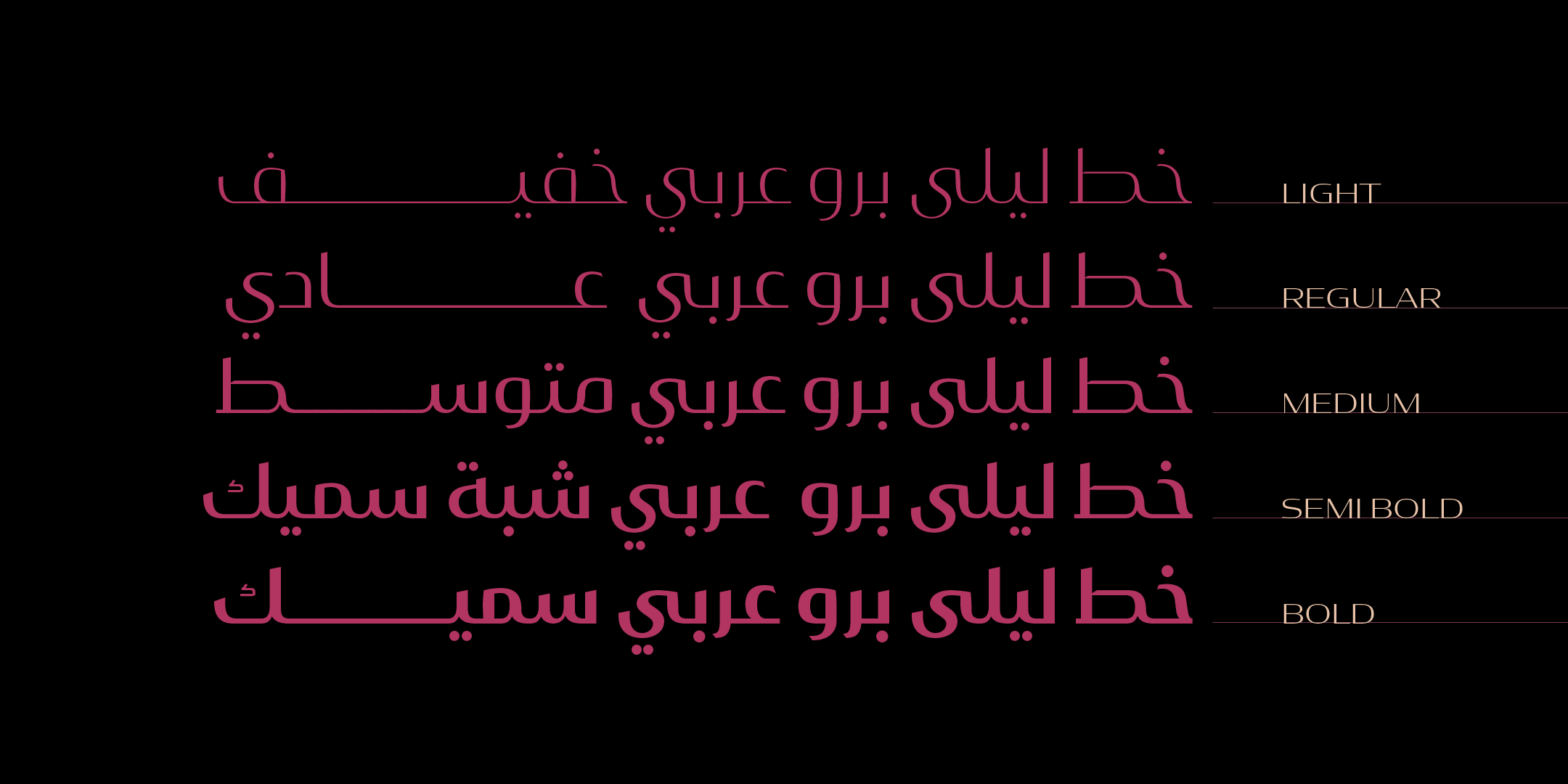
🎭 Luxury is not a single style
A jewelry house, a desert hotel and a contemporary fragrance brand each express luxury in a different way. The first tends toward high contrast and carefully measured extensions, the second toward a broad geometric structure, and the third toward stark simplicity.
Before you choose a typeface, decide what kind of refinement you are after. Then test your candidate in the most demanding use in your project: usually the smallest text on the packaging, not the biggest headline in the ad.
🖼 Typefaces from the collection
No ranking and no attempt to be complete: luxury is a mood that varies from brand to brand. These are some examples, and there are more in the collection:
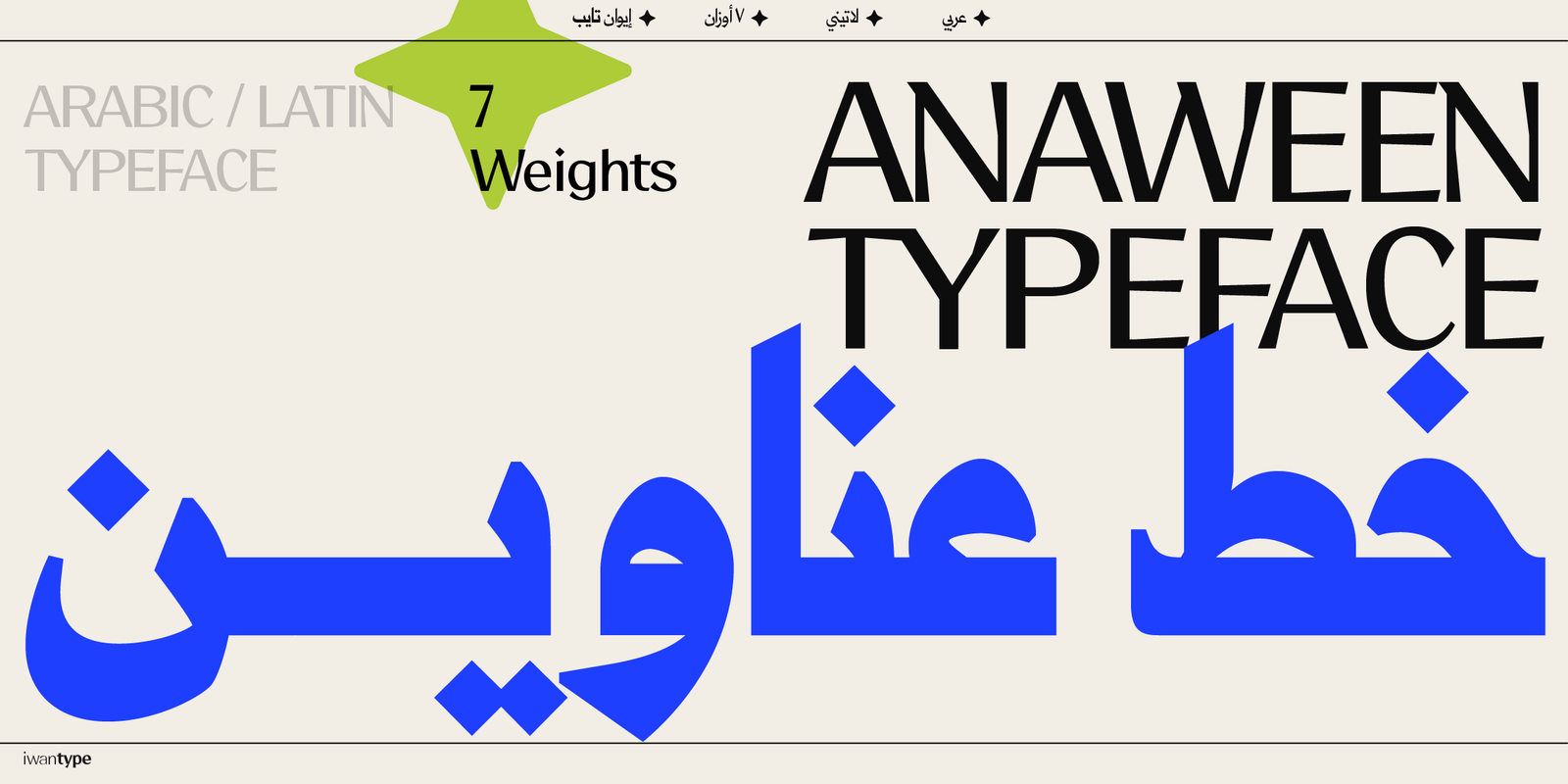
Anaween — a typographic Naskh with tall vertical proportions and tight spacing, drawing its identity from the tradition of newspaper and advertising type.
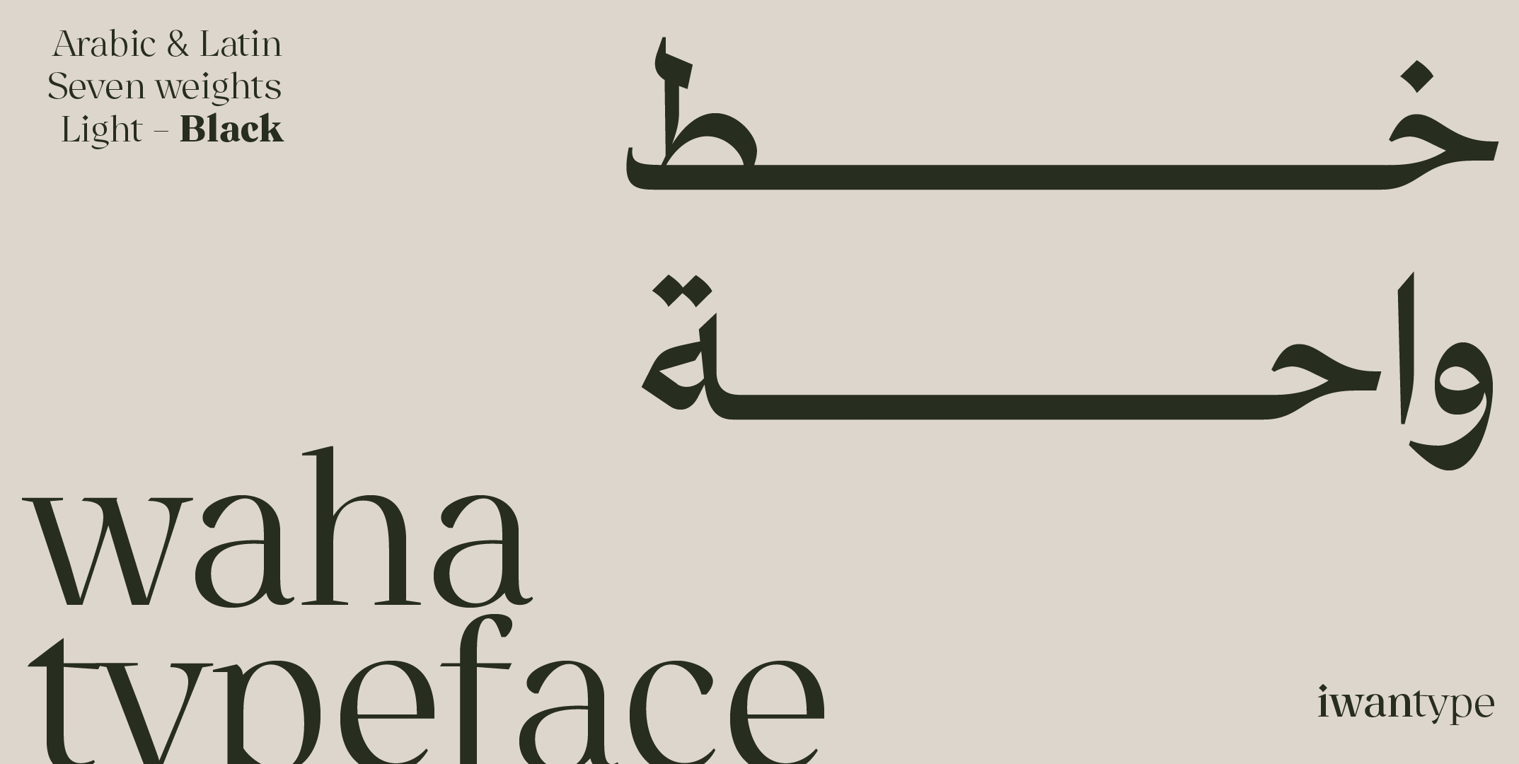
Waha — a presence rooted in a long-standing visual memory, inspired by the advertising Naskh that adorned products in the 1970s and 1980s with a touch of luxury.
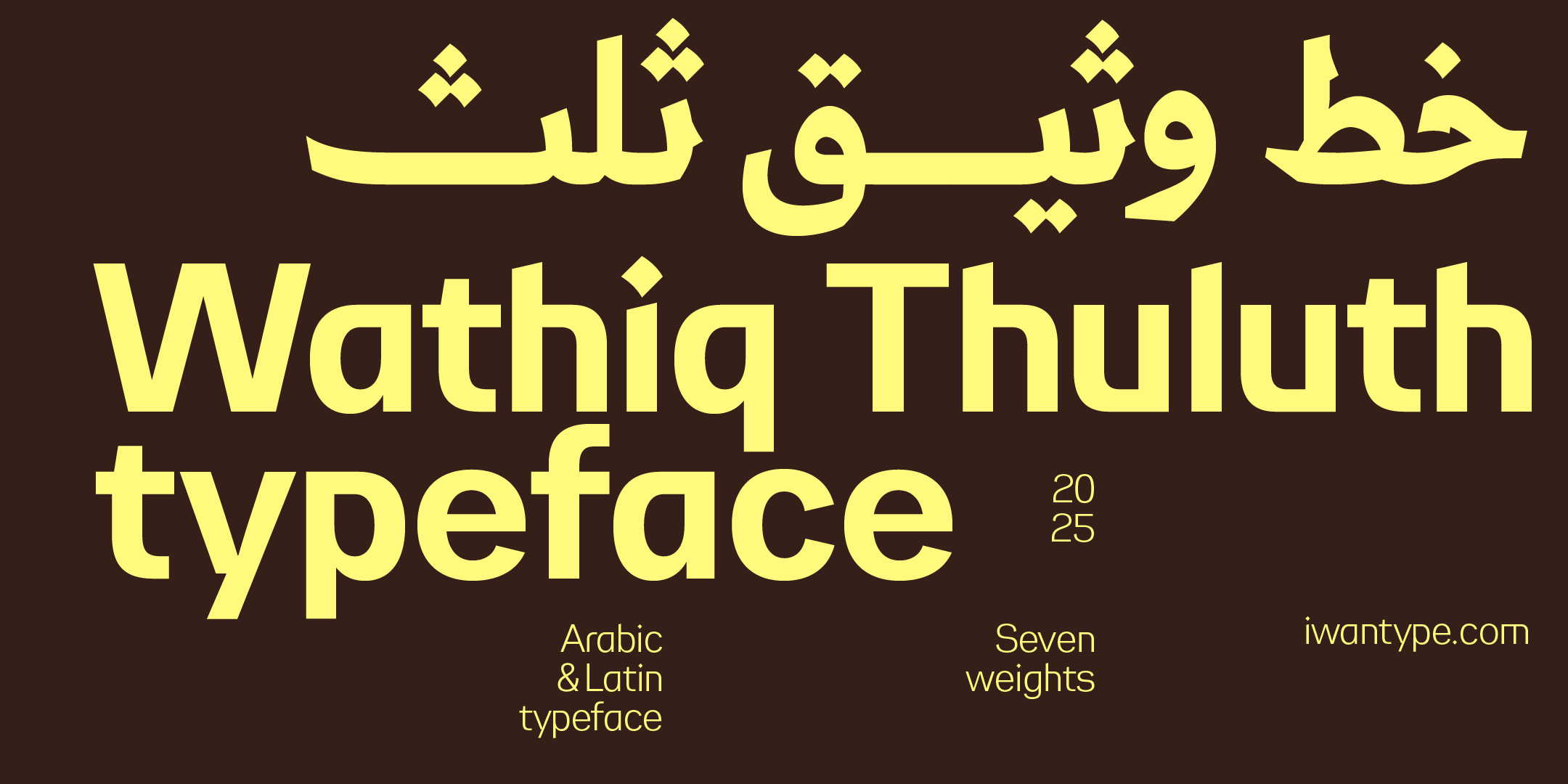
Wathiq Thuluth — brings together the spirit of Naskh, in its legibility and flow, and the grandeur of Thuluth, in its compositions and refined extensions.
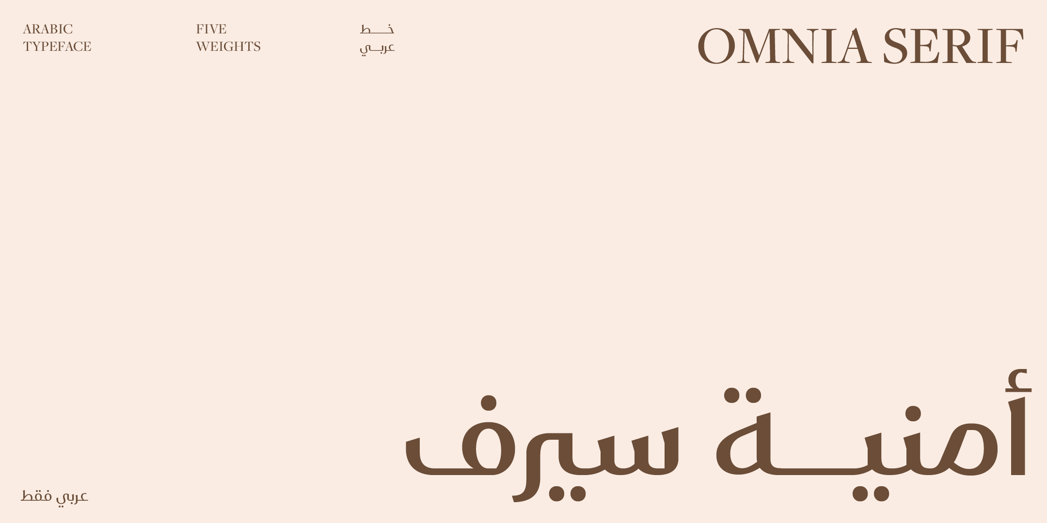
Omnia Serif — embodies the essence of elegance and flow, with graceful curves and a polished finish.
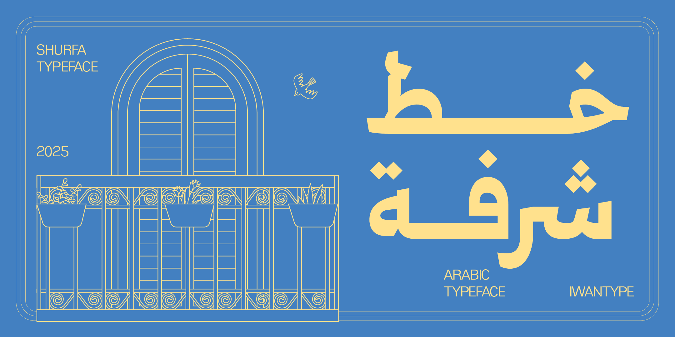
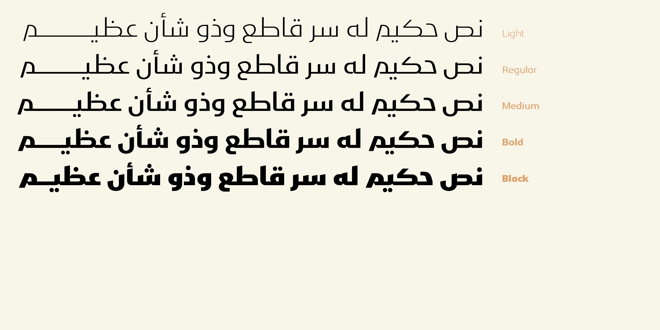
Shurfa — a Mastari Naskh inspired by the details and visual language of Thuluth, in seven weights from Light to Black.
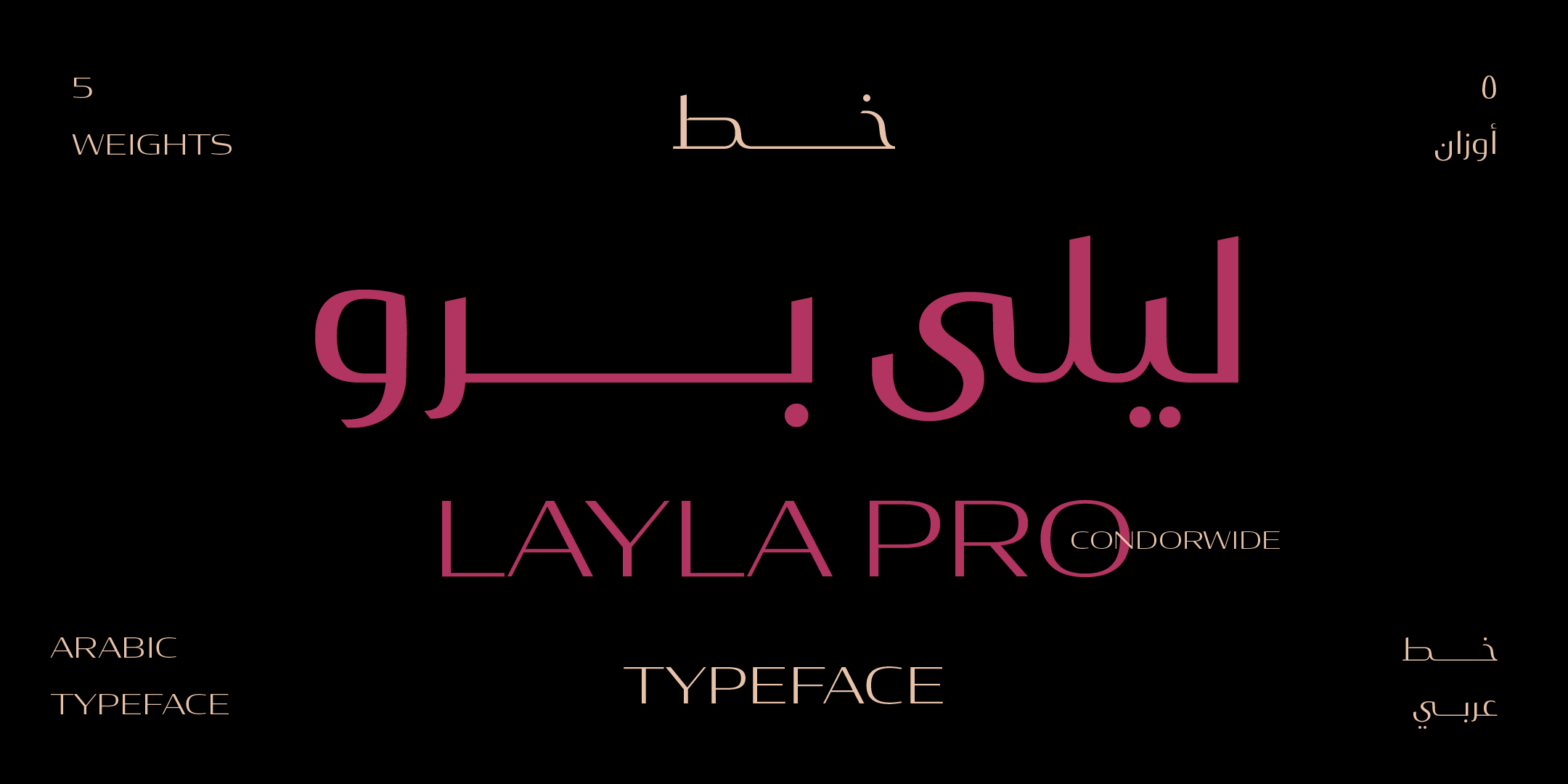
Layla Pro — inspired by Kufi with a Naskh influence: a hybrid that pairs modern proportions with a classical spirit.
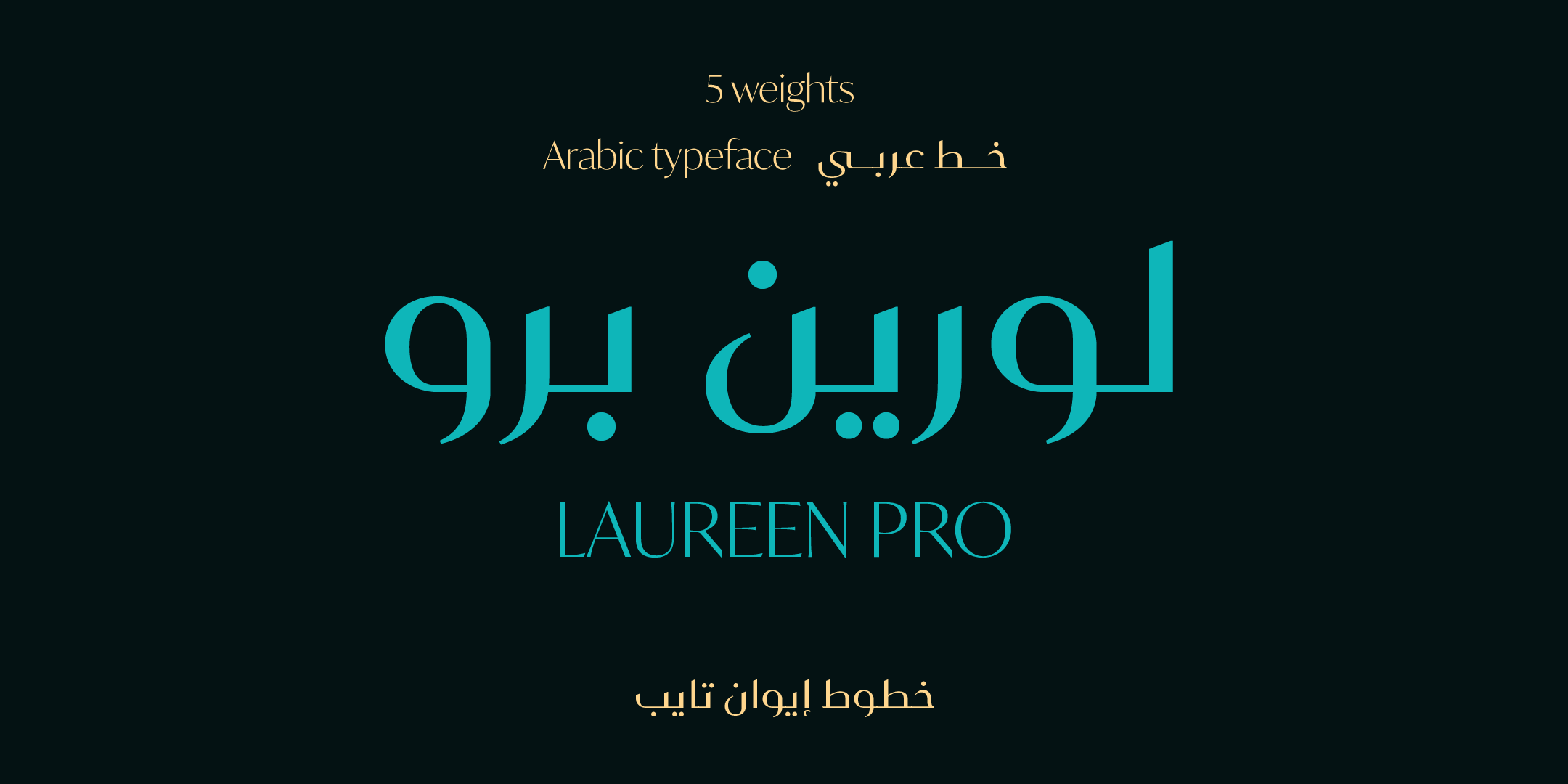
Laureen Pro — a very particular look that combines traits of different styles, influenced by both Kufi and Naskh.
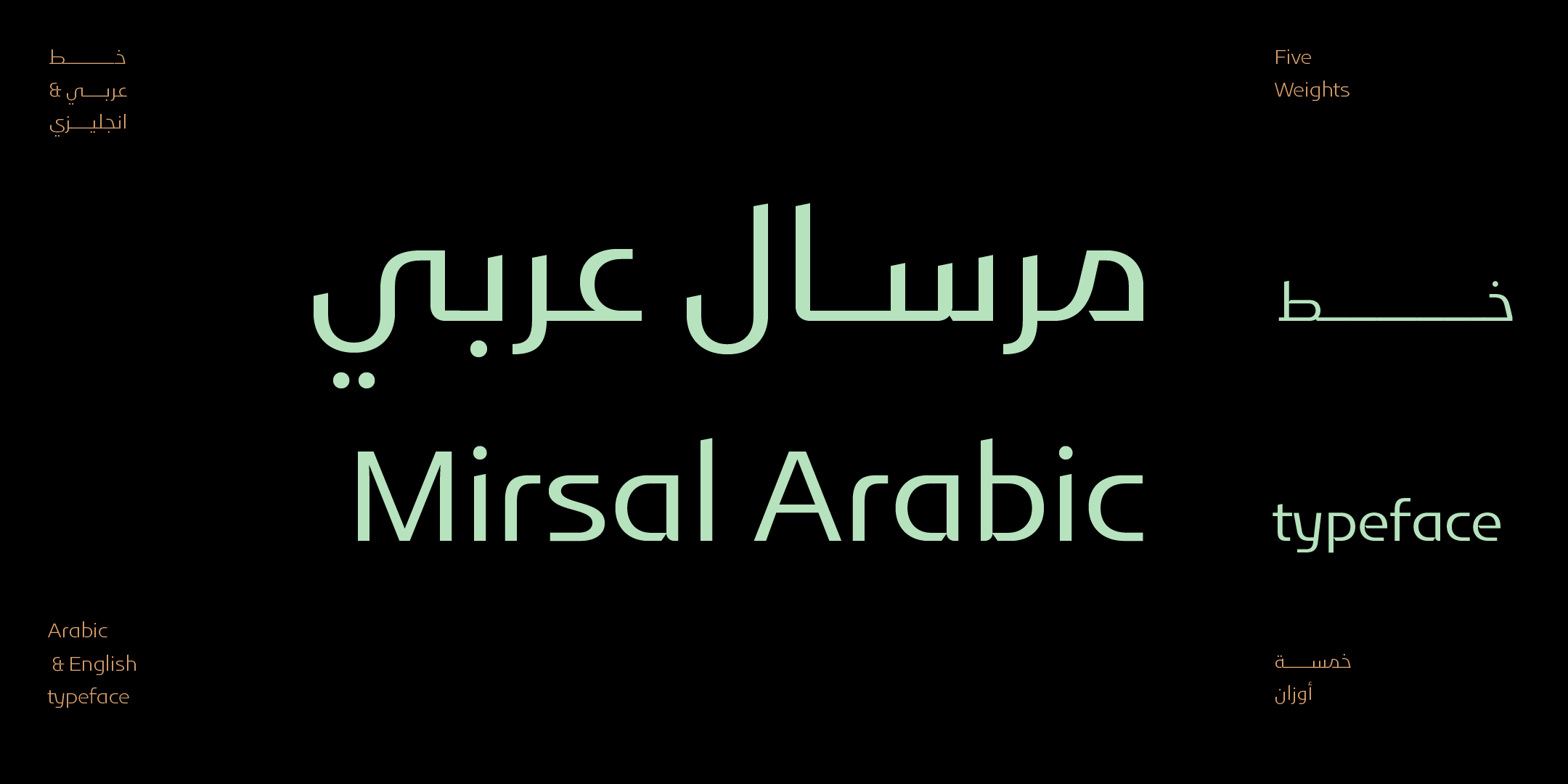
Mirsal — a blend of Fatimid Kufi and Naskh, poised between geometric letterforms and grace, with an air of luxury and strength.
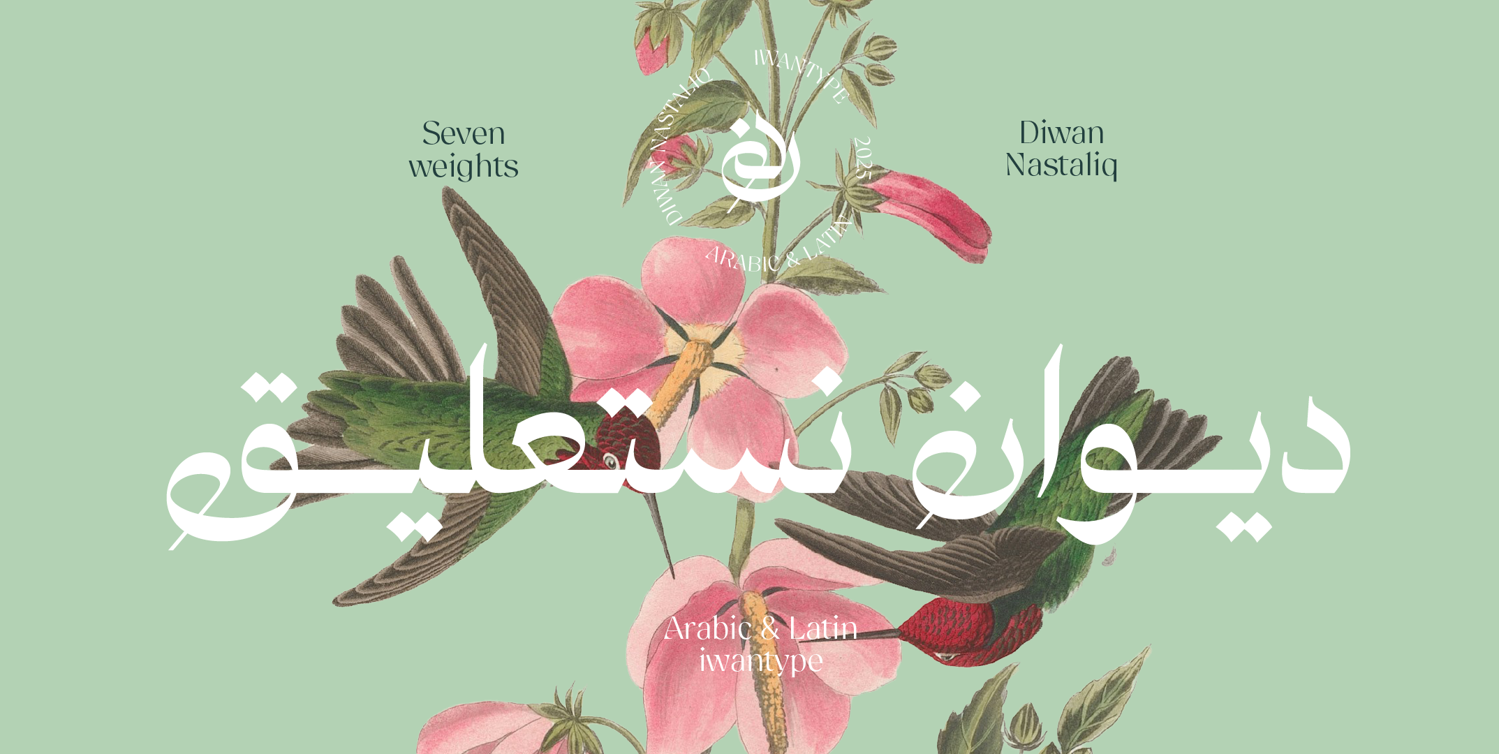
Diwan Nastaliq — flows like warm ink over soft fabric, with a calm sweep and a velvety touch. Seven weights, with Arabic and Latin support.

Iwan Zaza — a modern high-contrast typeface, inspired by Kufi with a Naskh influence.
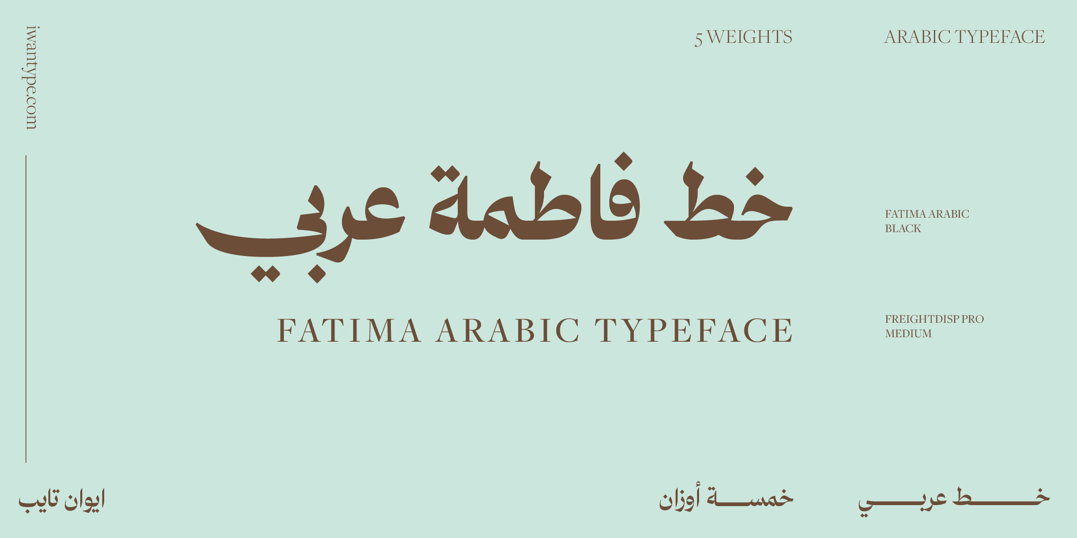
Fatima — stands apart from traditional typefaces with its high contrast and striking proportions, and comes with ligatures and stylistic sets.
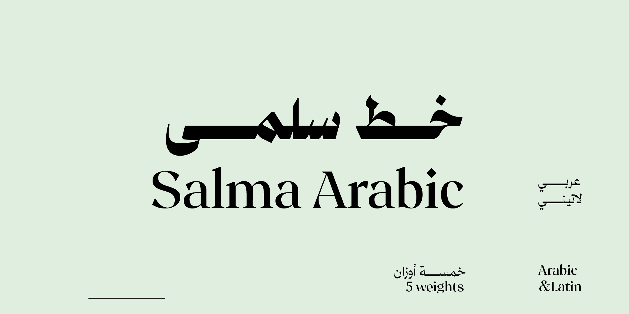
Salma — inspired by Mastari Naskh: high contrast and newly drawn connections between letters give it a striking beauty.
🔖 Browse the collection
- Buy with a commercial license — what each license covers
- Luxury Arabic fonts — the full archive
- Distinctive Arabic fonts — typefaces with a clear personality
❓ Frequently asked questions
Three things: a disciplined handling of space, carefully judged contrast between the thick and thin strokes of each letter, and a family of weights that keeps the brand consistent across every use. Ornament and flourishes are not a requirement, and they often have the opposite effect.
Usually not. Ornament works for a single moment, such as the logo or the cover, but it tires the eye when it repeats. Luxury brands rely on discipline and repetition more than on standing out through unusual forms.
One is enough in most cases, and two is a practical maximum: one for headlines and one for text. A third starts to break the visual unity.
It is better to pair it with a text typeface. Display typefaces are designed for large sizes, and that is where they give their best. For small packaging text, choose a text typeface from the same family, or one with a graded range of weights such as Qomra.
One thought on “Luxury Arabic fonts for brands: what actually makes type feel luxurious”
Comments are closed.