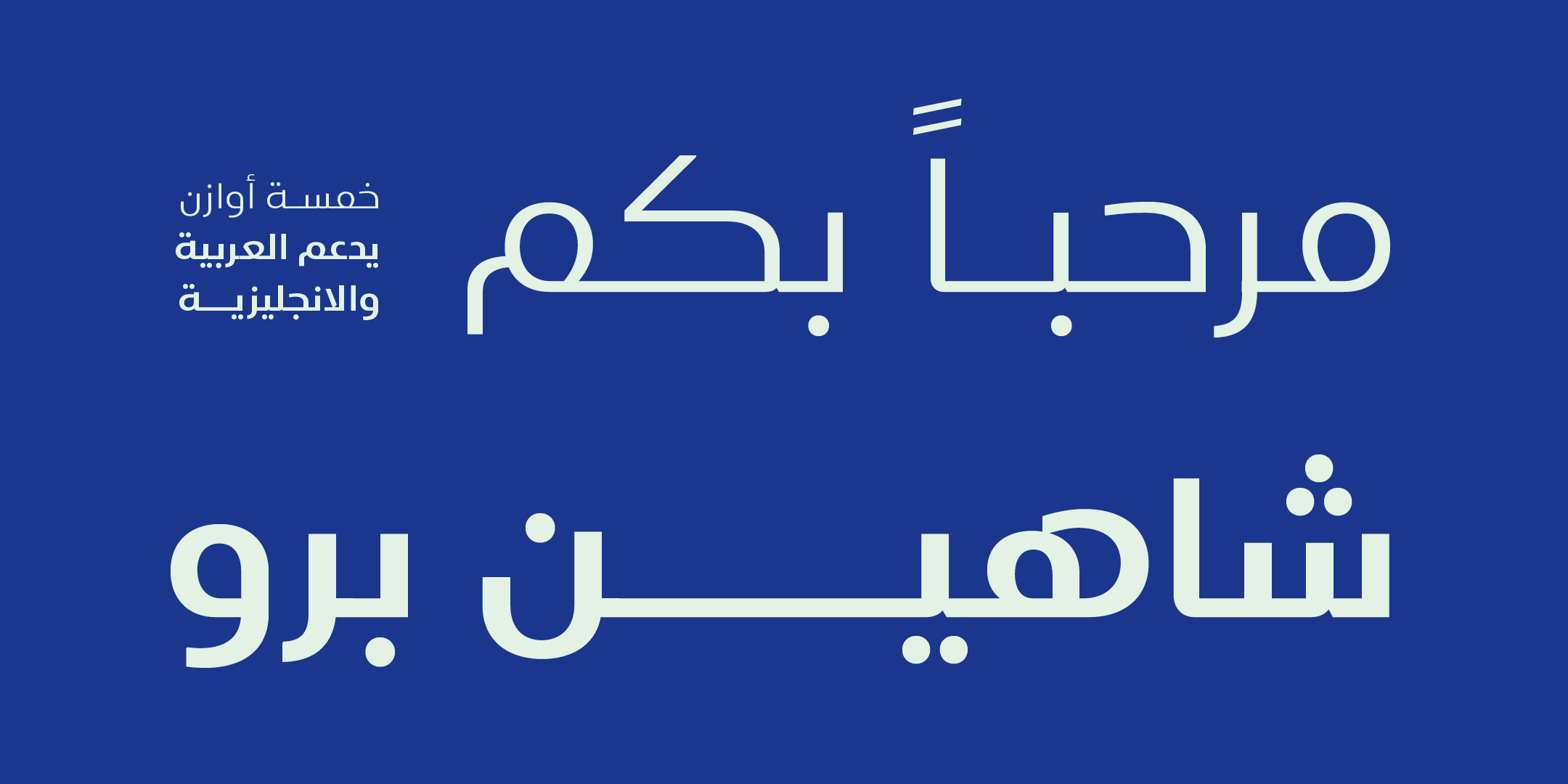
We often reduce a typeface to its name or its stylistic category, but the real effect does not come from classification. It comes from the shape of the letter itself.
A slight curve, a sharp angle, the thickness of a stem or the shape of a dot…
Every detail changes the overall feel of the identity.
🎭 Sharp letters vs. curved letters
Sharp angles often tend to suggest strength, rigor and clarity, and soft curves to suggest flexibility and warmth. These are possible perceptual tendencies, not a fixed dictionary: context, the word itself and color can sometimes reverse them.
A tech brand may benefit from measured sharpness. A cultural or creative project may need more softness.
The shape of the letter sets the mood before the word is understood.
⚖️ Stroke thickness and a sense of confidence
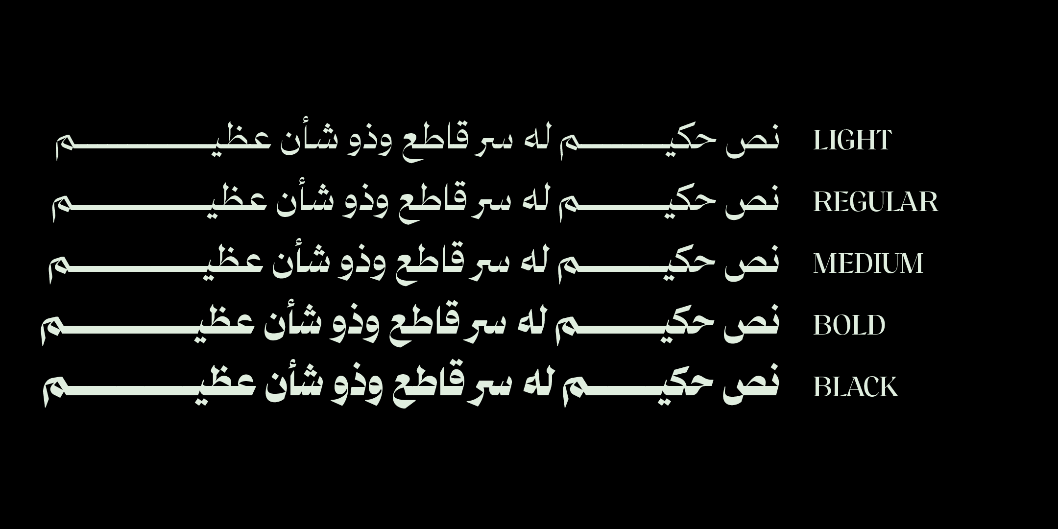
Heavy letters convey presence, strength and stability. Pushed too far, though, they can turn into excessive rigidity.
Light letters feel refined and airy, but they can look weak if they are not used in the right context.
A balanced identity does not depend on weight alone, but on how thickness is distributed within the letter itself.
🧩 The shape of the dots and other small details
In Arabic script, dots are not a minor detail. The shape, size and position of a dot affect the entire visual rhythm.
Soft, round dots give a sense of flexibility. Square or sharp dots give a sense of stability and clarity.
A small detail, but a big effect.
📏 Proportions and the length of extensions
Letters with long extensions can convey luxury and flow. Short, compact letters suggest density and focus.
An identity built on generous space may benefit from longer extensions, while small digital applications may need tighter proportions.
Proportions set the rhythm of an identity.
🔍 Contrast within the letter
Some typefaces rely on clear contrast between thick and thin strokes, which gives them a classical or elegant character.
Others keep their stroke thicknesses close, which feels modern and stable.
High contrast catches the eye, while low contrast brings visual calm.
🧠 A letter does not stand alone
A letterform is not judged in isolation but in the context of the word and the sentence.
A letter can be beautiful on its own and still create clutter when it repeats.
A visual identity is built on the overall rhythm, not on the beauty of a single detail.
🎯 What does this mean for designers?
When you choose a typeface for an identity, do not look only at its name or classification.
Look at:
- The shape of the curves
- The character of the angles
- How stroke thickness is distributed
- The shape of the dots
- The length of the extensions
Then ask yourself: does this shape reflect the feeling I want?
🖋️ At Iwan Type
We believe an identity starts with the letter, and that every detail within it helps build the overall feeling.
A typeface is not a set of similar letters but a complete visual system.
That is why we pay close attention to the shape of the letter itself: the shape is what creates the feeling.
🗂 From the collection
A selection from the Iwan Type collection:
- Mirsal — a blend of Fatimid Kufi and Naskh, poised between geometry and grace.
- Asal — a geometric structure with alternates and ligatures.
- Salma — Mastari Naskh with high contrast and striking connections.
- Rayat Round — soft, rounded terminals over a geometric structure.
To compare the license types and what each one covers, see commercial licenses for Arabic fonts.
❓ Frequently asked questions
How does the shape of the letters affect the feel of an identity?
Sharp letters convey strength and decisiveness, and curved letters convey warmth and softness. Stroke thickness affects the sense of confidence, and contrast within the letter affects the sense of refinement.
What does contrast within a letter mean?
It is the difference in thickness between the thickest and the thinnest parts of a letter. Low contrast feels industrial and sturdy; high contrast feels polished and precious, but it needs large sizes.