


A good brief does not describe the typeface you want. It describes the problem it solves.
The difference matters. A brief that says “We want an elegant, modern typeface” gives no one any direction, because every designer will read those two words in their own way. A brief that says “Our text is read on small screens in noisy environments, and we have 20 branches that print their own signs locally” guides every design decision that follows.
These are the eight sections an Arabic typeface project brief needs.
1️⃣ Why now
What prompted this project? A relaunch? Expansion into new markets? A problem that keeps coming up in implementation?
This section looks like a preamble, but it sets the priorities for the entire project. A typeface designed to solve a reading problem is fundamentally different from one designed to set a brand apart.
2️⃣ Exactly where it will be used
The most important section in the document. Write an actual list, not a general description:
- Print: what kind? Reports? Packaging? Signs? At what sizes?
- Digital: a website? An app? A dashboard? Display screens?
- Viewing conditions: indoors or outdoors? Good lighting or changing light? Up close or from far away?
- Who produces the work: an in-house team, or several agencies and suppliers?
The last item matters because it determines how “misuse-proof” the system needs to be.
3️⃣ Languages and scripts
- Arabic only, or Arabic with Latin?
- Do you need other languages written in Arabic script, such as Urdu, Kurdish or Persian? Each one has additional glyphs and behaves differently.
- What level of diacritics (tashkeel)? Fully vocalized text, partial diacritics, or none at all?
- Which numerals? Arabic-Indic (١٢٣), Western Arabic (123), or both? And if your project includes Urdu or Persian, there is a third style: Eastern Arabic-Indic (۱۲۳).
These answers determine the size of the project more than anything else.
4️⃣ The weights you need, and why
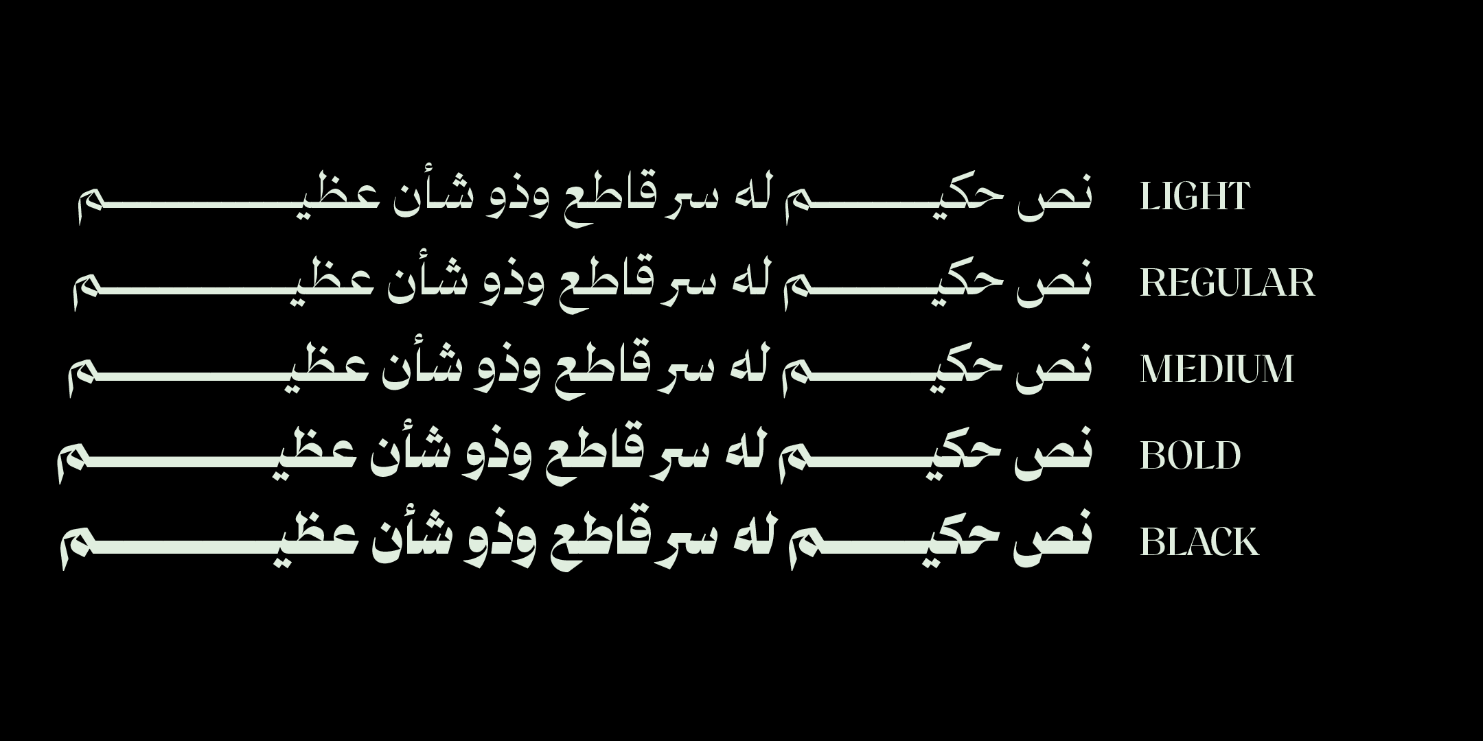
Do not ask for seven weights just because seven sounds like a complete set. Tie each weight to a use:
Light — for secondary labels in the interface
Regular — for report text
Medium — for subheadings
Bold — for headings and buttons
If you cannot find a use for a weight, drop it. Every additional weight expands the drawing, testing and review work, even when the intermediate weights are interpolated between masters. It is not just a mechanical increase in the thickness of the weight before it.
5️⃣ Brand personality: examples, not adjectives
Abstract adjectives are the worst thing in a brief. “Elegant,” “modern” and “trustworthy” mean different things to every reader.
Instead, give:
- Three brands that resemble what you want, and why. The second part matters more than the first.
- Three brands you do not want to resemble, and why. This part gives more direction than the one before it.
- One sentence about what your audience must not feel. “We must not look like a government agency” is clearer than ten positive adjectives.
6️⃣ Technical constraints
- Production environments: which software and systems? Some do not support optional features at all.
- Will the font be embedded in a digital product? That changes the file requirements.
- Are there limits on file size? This matters for apps and websites.
- Does it have to work alongside a typeface you already use?
7️⃣ Who decides, and how reviews work
Spell it out:
- Who gives feedback
- Who gives final approval: one person or a defined committee
- How conflicting feedback is reconciled before it is sent
- How often you expect reviews to happen
This section matters more than half the document. Vagueness here stalls more typeface projects than any design issue does.
8️⃣ What gets delivered
- File formats for your working environments
- A usage guide that explains the weights and features
- A test file in real contexts from your own materials
- Ownership and exclusivity arrangements
- Who handles changes later
📎 Attach real materials, not mock-ups
The most powerful thing you can attach to a brief: actual materials from your work.
A page from your latest report. A screenshot of your app’s interface. A photo of a sign at a real branch. Text from your product manual, with its longest words and trickiest letter combinations.
These tell the designer what no description can: how dense your text is, the kind of vocabulary you use, how much you rely on numbers, and the environment the typeface will live in.
🧭 Three habits that make a brief stronger
Describe the problem and the constraints, and leave drawing the solution to the designer. Legitimate constraints, such as identity, accessibility or technical requirements, belong in the brief, stated explicitly. But “we want sharp terminals” and “a kaf (ك) with a short tail” naturally belong in your conversation with the designer during the work: you are paying for their expertise, and the strongest results come when they suggest something that had not occurred to you.
Make your visual references specific. When you attach an existing typeface, say exactly what you like about it. Its density? The tone of its curves? How it behaves at small sizes? A specific reference saves weeks of experiments; an unqualified one locks the designer into imitation.
Settle open questions early. Every point settled in the brief today saves a costly revision at a late stage tomorrow.
✅ Test the brief before you send it
Give it to someone outside the project and ask: What problem does this typeface solve?
If they cannot answer in one sentence, the brief needs more work.
When you are ready, start the conversation about your project from our custom fonts page, and browse the full collection along the way: knowing what already exists makes your brief more precise about what is missing.
🔖 Browse the collection
- When does a company need a custom typeface?
- Before commissioning a custom Arabic typeface
- All typefaces
❓ Frequently asked questions
Eight sections: the reason for the project, exactly where the typeface will be used, languages and scripts, the weights you need tied to their uses, brand personality shown through examples, technical constraints, who decides and how reviews work, and the list of deliverables.
Exactly where the typeface will be used. That shapes every design decision that follows: display sizes, lighting conditions, who produces the work, and whether the system needs safeguards against misuse.
With three examples that resemble what you want and why, three you do not want to resemble and why, and one sentence about what your audience must not feel. Negative examples give more direction than positive ones.
No. Describe the problem, not the solution. Dictating the shape of the letters means paying to have your own idea executed, rather than benefiting from the designer’s expertise.
Actual materials from your work: a page from a report, a screenshot of an interface, a photo of a real sign, a passage with your hardest letter combinations. These reveal what no description can.