


The screen is a harsh environment for Arabic type. Text appears at small sizes, on displays of varying pixel density, and in contexts the designer doesn’t control: a narrow button, a two-word notification, an input field, a list of twenty items.
The typefaces that succeed here share specific qualities. From the Iwan Type collection: Ghroob Geometric, Ruaq, Simah Pro, Shaheen Pro and Orleen.
📐 Four technical criteria
X-height and apertures
These are the two most important factors for reading at small sizes. A large x-height means bigger letters at the same point size, and open apertures keep letters from filling in as they get smaller.
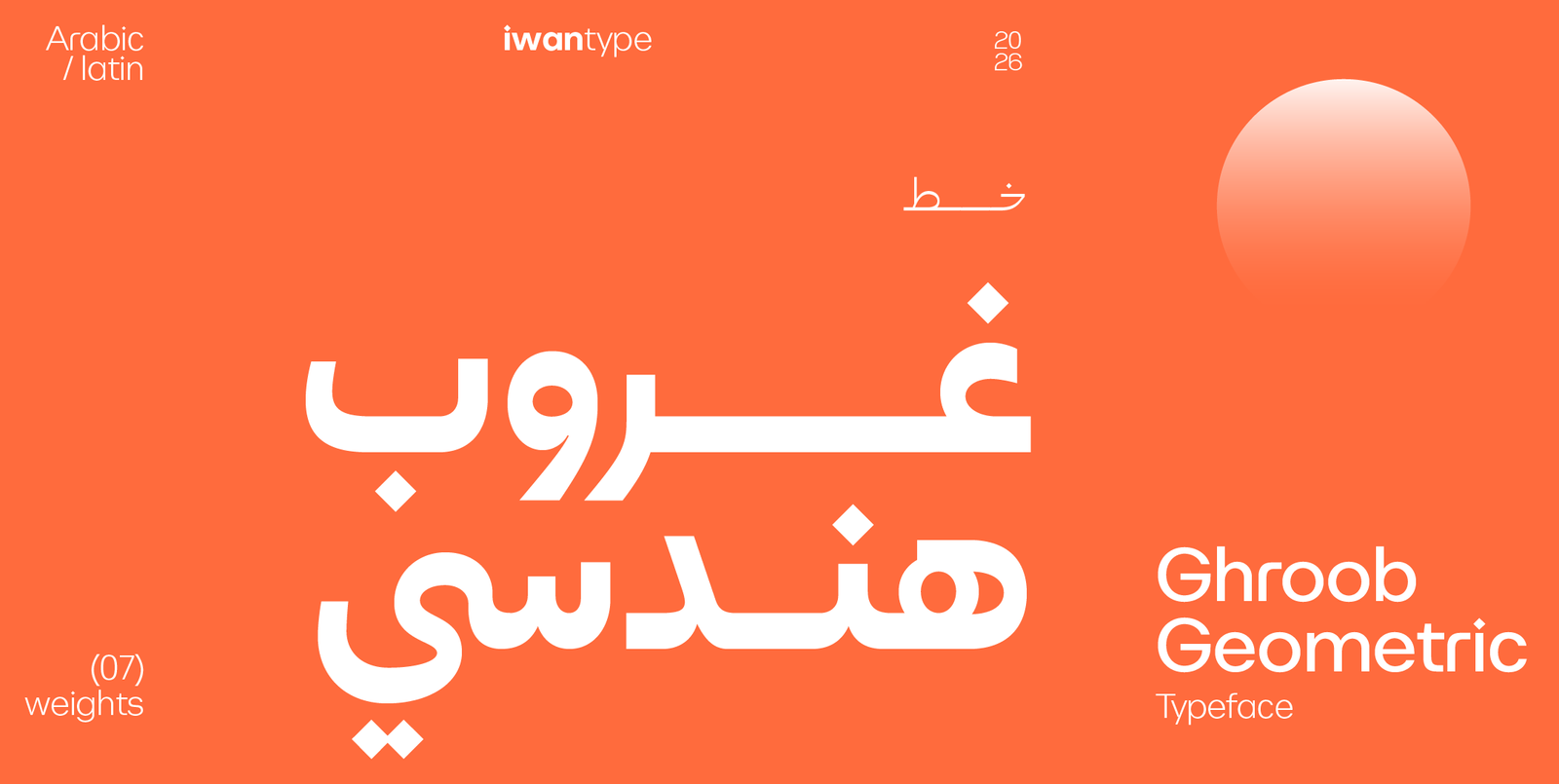
Ghroob Geometric has a clear, balanced geometric construction drawn for digital use. It comes in seven weights and in both Arabic and Latin, which makes it a practical starting point for interfaces as well.
Try it yourself: type تشتّت and مستشفى at 12 px. If the shin (ش) fills in and the dots run together, the typeface isn’t right for your interface.
Low contrast
What looks elegant in high-resolution print disappears on an ordinary screen. The thin strokes of high-contrast typefaces turn faint or break up.
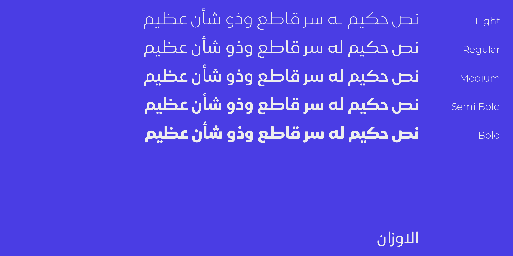
That is why interface typefaces tend toward low, even contrast. Ruaq is a good example: geometric, with soft edges and simple strokes, in five weights from Light to Bold.
A graded range of weights
An interface has to set apart the heading, the body text, the secondary label and the button. With only two weights, you are left relying on size and color alone.
Shaheen Pro offers five weights and Ghroob Geometric seven, a range wide enough to build a precise hierarchy.
Licensing
This is the point that gets forgotten until launch, and then it becomes a problem.
The Desktop license covers design work on your own devices, print included, but not websites or apps. Each font page lists the licenses available for that typeface, and some leave out the Web license to keep the choice simple. A Web license is still available on request for any typeface in the collection, so email us at info@iwantype.com before you rule one out for that reason. Using the font on a website (through @font-face) needs a Web license, sized by your monthly traffic. Embedding it in a mobile app is covered by the Unlimited license, which includes your devices and one website with unlimited traffic too. Some typefaces also offer a single-app license. Review the license types and the full terms, and settle on yours before you buy, not after.
🚀 Before launch
Test the typeface in your tightest context, not your roomiest:
- A button with a single long word
- A notification truncated with an ellipsis
- An input field with gray placeholder text
- A list that mixes Arabic with English names
- Dark mode: light text on a dark background looks heavier, and you may need a lighter weight
That last one surprises many people. A typeface you tuned in light mode can look too heavy in dark mode.
🔖 Browse the collection
- Modern Arabic fonts — the best fit for interfaces
- All typefaces — the full collection
- Arabic fonts
❓ Frequently asked questions
Yes. The Desktop license doesn’t cover embedding the font in a website or an app. A website needs a Web license, sized by monthly traffic. The Unlimited license covers your devices, one website with unlimited traffic and your mobile apps on iOS and Android, and some typefaces also offer a single-app license.
A large x-height, open apertures and counters that don’t fill in when the text gets small, and low contrast that keeps every part of each letter clear on screen.
Three to four are enough for most interfaces: light for secondary labels, regular for text, medium for subheadings and heavy for headings and buttons.
One thought on “Arabic fonts for websites and apps: the criteria that matter on screen”
Comments are closed.