


The short answer: an Arabic brand identity needs either one family that can carry the core roles (the logo, headlines and small text) or a clear system that pairs a display typeface with a text typeface built to work alongside it. From the Iwan Type collection, here are starting points by brand personality: Huwiya Display for brands that want a calm, elegant presence, Wathiq Thuluth for institutions that want gravitas and a sense of heritage, Ghroob Geometric for tech and digital brands, and Anaween for luxury and product brands.
The rest of this article explains why these in particular, and where the choice usually goes wrong.
⚠️ The recurring mistake: choosing the logo typeface, then finding it works for nothing else
Most identity projects I see start with the logo. The designer picks a beautiful typeface, sets the name in it and the client approves it. Then the real problem begins: the annual report, the app interface, the exhibition panel, the price list.
A typeface that looked stunning in two words becomes tiring in a paragraph and unworkable in a table.
The practical test: try it at the real sizes and in the real contexts the identity will use, from the logo and headlines to a paragraph of text, a screen, a table and a sign. If it fails in one of those roles, assign a second typeface to that role. That is a legitimate decision, as long as you make it deliberately rather than by accident.
🔍 What makes an Arabic typeface right for an identity
A graded range of weights
An identity system needs variation: a heavy headline, regular text, a light detail. A single-weight typeface forces you to build hierarchy with size and color alone, and those tools run out fast.
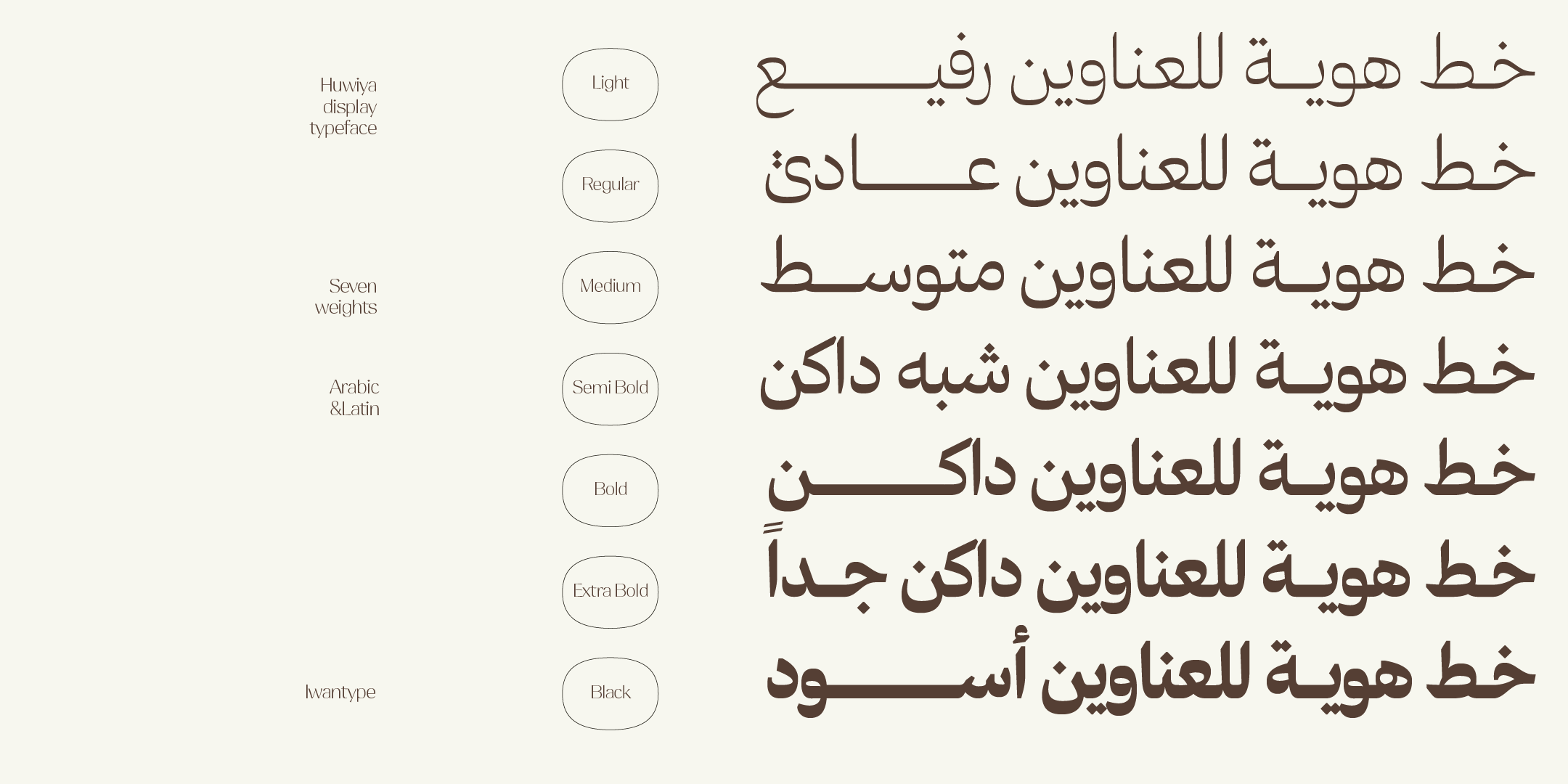
In practice, that rules out single-weight typefaces. Modern free families with several weights do exist, but with those the difference is distinctiveness, not the number of weights. From the collection, Wathiq comes in seven weights, while Huwiya, Qomra and Fatima come in five, from Light to Black.
Counters
Look at the ain (ع), fa (ف) and qaf (ق) at a small size. If their counters are tight, they will fill in on small print and low-resolution screens, and the word turns into a grey blot.
Huwiya Display is built the opposite way: generous counters and curves that lean toward the square. That is where its legibility comes from, and it is also what makes it work on a sign read from far away.
Contrast
Contrast is the difference in thickness between the heaviest and the thinnest parts of a letter. High contrast is beautiful and distinctive. It is also risky.
Salma and Fatima are both high-contrast typefaces, and both make a striking impression in large headlines. In 9 pt text, though, their thin strokes may weaken or break up, depending on the paper, the printer, the screen and the weight, so test them in the real production medium. That is not a shortcoming but their specialty: they were made for presence. When the project also needs small text, pair them with a text typeface such as Qomra, and the system has both layers covered.
Latin support
Most brands in the Gulf market need at least an English version of their name. A Latin companion designed alongside the Arabic makes the system easier to build, but it is not a requirement: two separate typefaces can be paired successfully if they are tested together for proportions, weights and rhythm. Pairing them without that calibration is what makes one identity look like two.
Wathiq, Huwiya Display, Anaween, Salma and Ghroob Geometric include both scripts.
🔖 Browse the collection
- All typefaces — the full collection
- Arabic fonts
- Luxury fonts for premium brands
❓ Frequently asked questions
Yes, if its license clearly allows commercial use, and some modern free families do come in multiple weights. The more important question for an identity is distinctiveness: a typeface available to everyone cannot set one brand apart, and an identity meant to last for years deserves a voice that is less common and more distinctive.
Three is a practical minimum: light for details, regular for text and heavy for headlines. Four or five give you more flexibility without the system becoming chaotic.
Yes. The Desktop license covers design work and print. Using the font live on a website needs a Web license, and embedding it in a mobile app is covered by the Unlimited license; some typefaces also offer a single-app license. Each font page lists the licenses available for that typeface. Review the license types and the full terms before you buy.
One thought on “Arabic fonts for brand identity: how to choose and where to start”
Comments are closed.