


Calligraphy and type differ in one fundamental way. A calligrapher writes one specific word and balances its extensions and ligatures for that case alone. A typeface has to work in every word, including words its designer never imagined.
That is why you can’t “convert” Thuluth calligraphy into a font by copying its shapes. What it takes is distilling its logic (its proportions, its rhythm and the way it handles space) and then rebuilding it on typographic rules.
In the Iwan Type collection, the Wathiq family takes this distillation in three directions: Wathiq Thuluth, Wathiq Nastaliq and Wathiq Ruqaa. Alongside them are Diwan Nastaliq and Ghroob Nastaliq.
👑 Thuluth: gravitas and presence
Thuluth is the style of large compositions and vertical extensions. Historically it was used for headings, architecture and copies of the Qur’an, and rarely for long texts. That division still holds today.
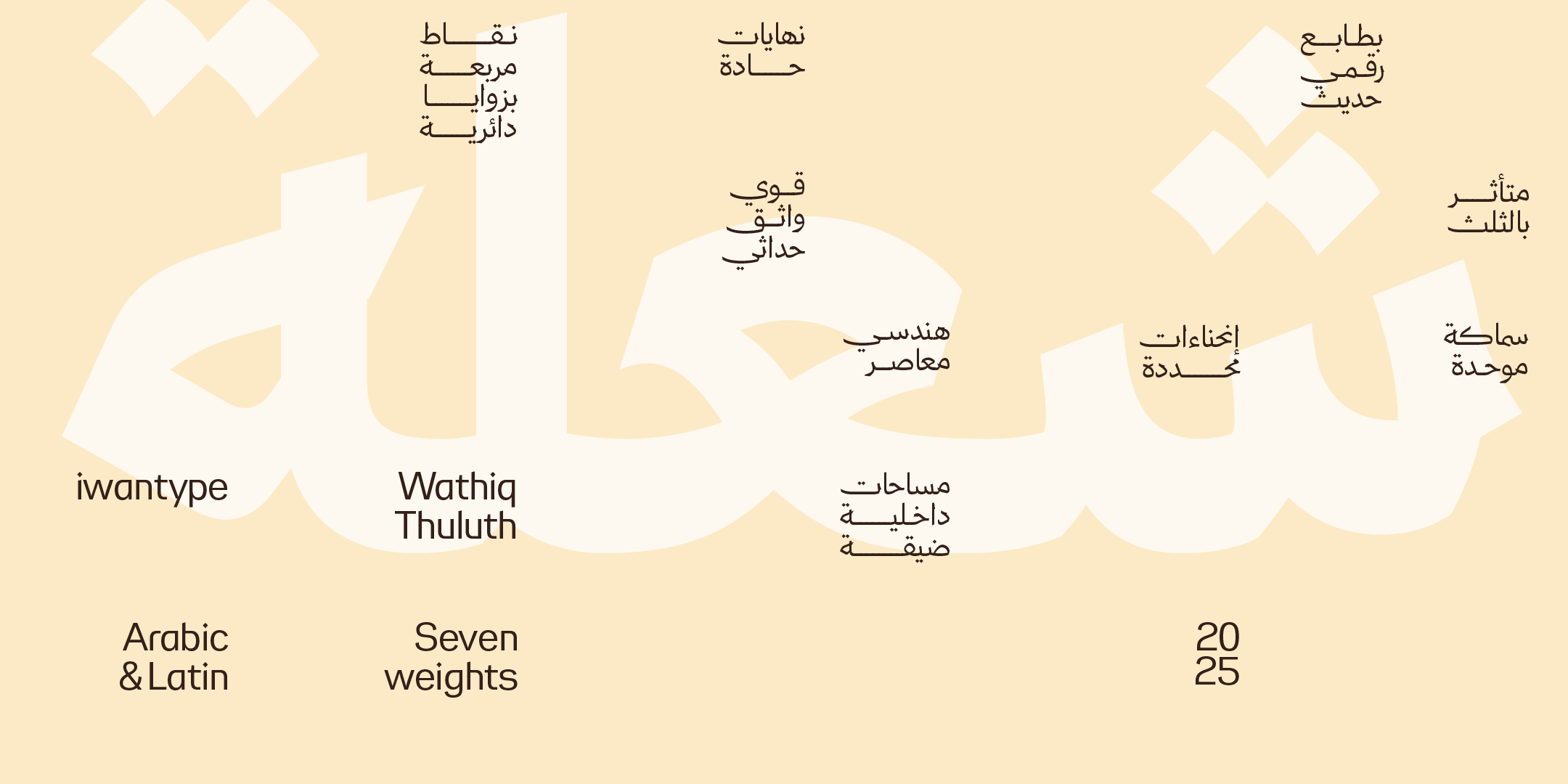
Wathiq Thuluth combines the legibility and flow of Naskh with the grandeur of Thuluth’s compositions and extensions. The result is a typeface that works for corporate identity, headlines and advertising without asking the reader to crack a code.
Use it for: logos, headlines for official and cultural bodies, covers and signs. For long text and interfaces alongside it: Wathiq from the same family, which keeps the proportions and works at small sizes.
🌊 Nastaliq: the sloping flow
Nastaliq is a style of Persian origin, marked by its sloping line and words that flow downward from right to left. Its rhythm is completely different from Naskh: less rigid and more animated.
The challenge in turning it into a font is the slope itself. It makes the line height variable, so digital systems need line-height settings and enough room for deep descenders and stacked letters.
The collection offers five different treatments:
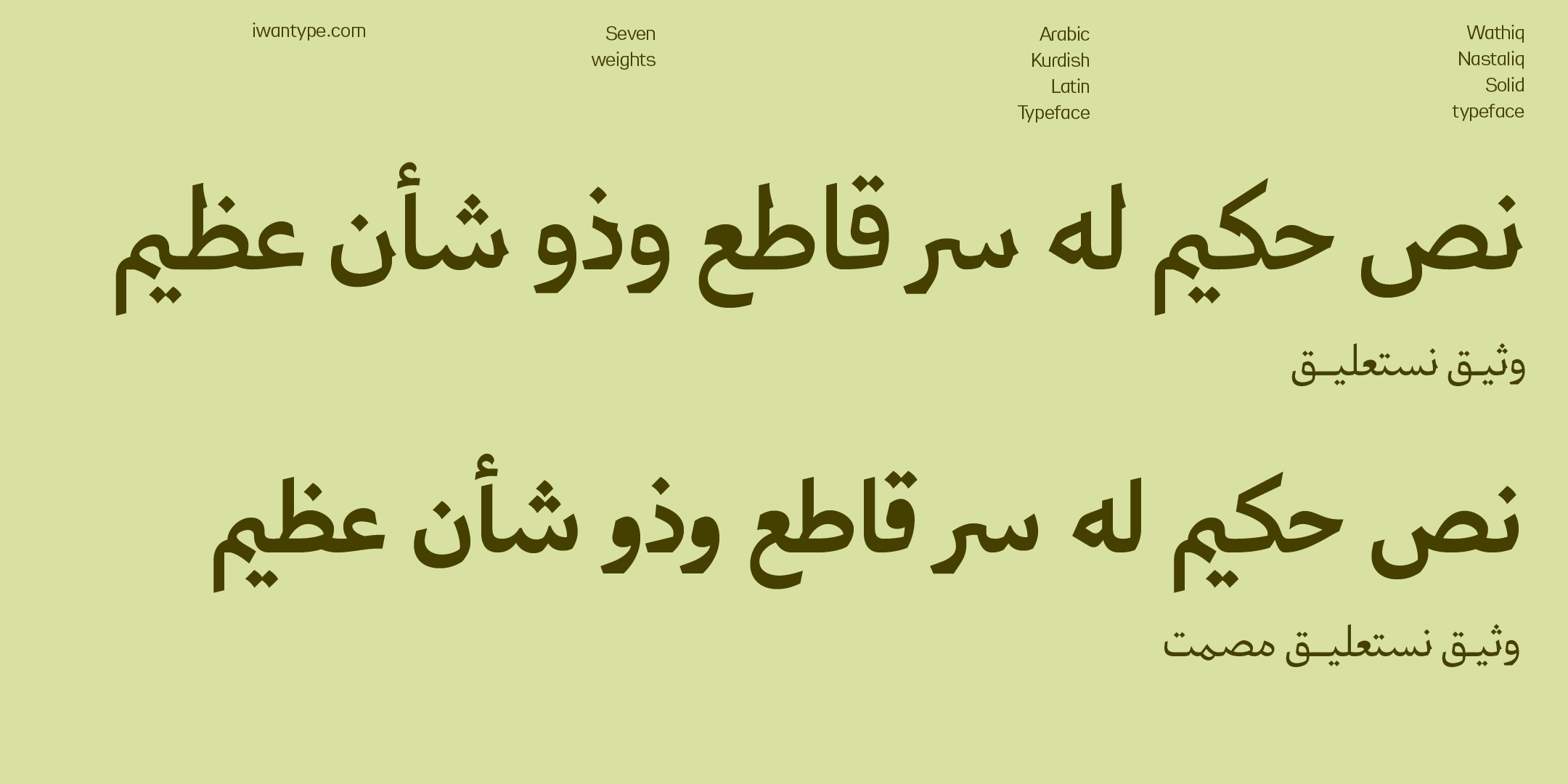
- Wathiq Nastaliq — combines the legibility of Naskh with the grace of Nastaliq in a calm, balanced treatment, for projects that want presence without excessive luxury
- Masaq — another take on the same treatment
- Wathiq Nastaliq Solid — a denser version for a strong presence
- Diwan Nastaliq — seven weights, in Arabic and Latin
- Ghroob Nastaliq — brings Naskh and Nastaliq together
Use it for: headlines with a literary or cultural character, quotations, book covers and invitations. For tables and interfaces alongside it: Ghroob, with its level baseline. The Nastaliq slope is meant for headlines; vertical alignment is a different job.
✍️ Ruqaa: fast and legible
Ruqaa is the everyday handwriting of the Mashriq, the eastern Arab world: short extensions, quick to write, direct. That is what makes it one of the most familiar styles for readers in the Mashriq (we see it on signs, in ads and in handwriting), although how familiar it feels varies between countries and generations.
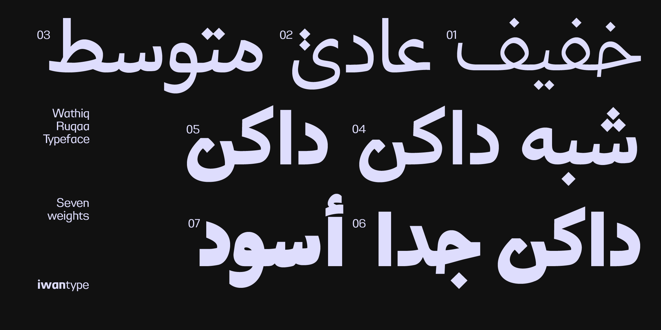
Wathiq Ruqaa draws on that spirit in a contemporary way, combining the traditional legibility of Ruqaa with smooth readability and a balanced geometric structure. Its product description says explicitly that it was developed for modern print use and digital interfaces.
Use it for: headlines and short texts, and content that wants to feel familiar and close to the reader. Ruqaa is an everyday, approachable style by nature, and that is its strength.
🧩 The advantage of a single family
Having these styles come from a single family, Wathiq, solves an old problem in heritage-inspired identities.
A cultural project usually needs more than one voice: a majestic headline in Thuluth, a flowing quotation in Nastaliq and clear text in Naskh. When these come from different sources, the stroke thickness and proportions clash.
When they come from one family, you get variety without breaking visual unity. A single family isn’t a requirement, since a well-considered pairing of different families can work, but it is the shortest route to matching stroke thickness and proportions.
🔖 Browse the collection
- Buying with a commercial license — what each license covers
- Naskh fonts — the foundation these styles are built on
- Luxury fonts for heritage-inspired projects
❓ Frequently asked questions
A calligrapher writes one specific word and balances its extensions for that case alone. A typeface has to work in every possible word, including ones its designer never imagined. So the traditional style isn’t copied shape by shape: its logic is distilled and rebuilt on typographic rules.
Pure Thuluth is a style of large compositions and extensions, historically used for headings and architecture, not for setting long text. Wathiq Thuluth, however, is not pure Thuluth: its structure is clearly Naskh, carrying the grandeur of Thuluth in its compositions, so it works for logos, headlines and covers and can handle short and medium-length texts in formal identity settings.
Naskh is balanced and clear, and it is the basis of printed text. Nastaliq slopes and flows with a livelier rhythm, and suits literary headlines and quotations. Ruqaa has short extensions and is quick and direct; it is the closest to everyday handwriting in the Mashriq.
Yes, and it’s common in cultural projects. But choose the styles from one family where you can, such as the branches of the Wathiq family, so that stroke thickness and proportions match and the identity doesn’t turn into a set of clashing voices.