Choosing the typeface for a brand identity is not a cosmetic step at the end of the process. It is a core decision that shapes how the brand will look and how it will be understood. Type is not a layer added on top of the identity; it is part of its structure.
A good identity can lose its strength because of its typeface rather than its idea: a typeface that doesn’t reflect the project’s real personality, especially one that doesn’t suit the way it will be used.
🎭 Start with the brand’s personality before the look of the type
Before you look for a beautiful typeface, ask: what kind of brand is this?
Is it:
- Formal or friendly?
- Cultural or commercial?
- Bold or calm?
- Traditional or contemporary?
A typeface doesn’t create a personality; it translates it into visual form.
If the personality isn’t clear, the choice of typeface will be arbitrary, however beautiful it looks.
📍 Map out where it will be used
Where will the typeface appear?
- Only in the logo?
- In campaign headlines?
- In long-form text?
- In digital apps?
- In official print materials?
A typeface that is excellent for a logo can fail in body text, and a great headline typeface can be tiring in everyday use.
The function determines the choice.
👁️🗨️ Test legibility before beauty
A typeface may be visually distinctive, but if it isn’t legible across different sizes, it isn’t right for an identity that has to last.
Ask yourself:
- Does it read clearly at small sizes?
- Does it keep its character at large sizes?
- Does it work well on a range of backgrounds?
An identity needs a typeface that lasts, not one that grabs attention only once.
⚖️ Pay attention to rhythm and balance
Arabic script is built on the inner rhythm between letters and on the balance between mass and space.
When you choose a typeface for an identity:
- Watch how the stroke thickness is distributed
- Notice the shape of the dots
- Pay attention to the character of the curves
- Make sure the letters hold together in long words
A strong identity needs a balanced typeface, not one crowded with tiring details.
🔄 Think about long-term flexibility
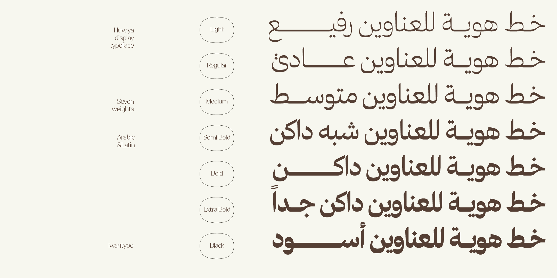
Does the typeface come in multiple weights? Can it be used for both headlines and text? Can you build a complete visual system with it?
A limited typeface may serve you today, but it will hold you back tomorrow.
An identity needs flexibility, not a stopgap.
🧪 Try the typeface within the whole system
Don’t test the typeface on its own. Put it together with the colors, the images, the white space and the overall layout.
Sometimes a simple typeface looks ordinary on its own but becomes very strong within a complete visual system.
And sometimes a very distinctive typeface falls apart once it is placed in the identity.
Context is the real judge.
🧠 The right decision is not the most eye-catching one
Choosing a typeface is not a search for the most beautiful or the most unusual. It is a search for the best fit.
The right typeface:
- Serves the idea
- Reflects the personality
- Works quietly
- Gives the brand a clear voice
🖋️ At Iwan Type
We see type as a strategic tool within an identity, not a cosmetic element. We believe a good typeface is one that lives with a brand for years and gives it a steady, balanced voice.
That is why we always start with the question: what do we want the brand to say?
Then we look for the typeface that says it best.
🎯 So which typeface should you choose?
The principles above help you judge. The practical question remains: where do you start?
A few examples from the Iwan Type collection:
- Huwiya Display — a display typeface with generous counters and curves that lean toward the square.
- Anaween — tall vertical proportions and tight spacing, drawn from the tradition of newspaper and advertising type.
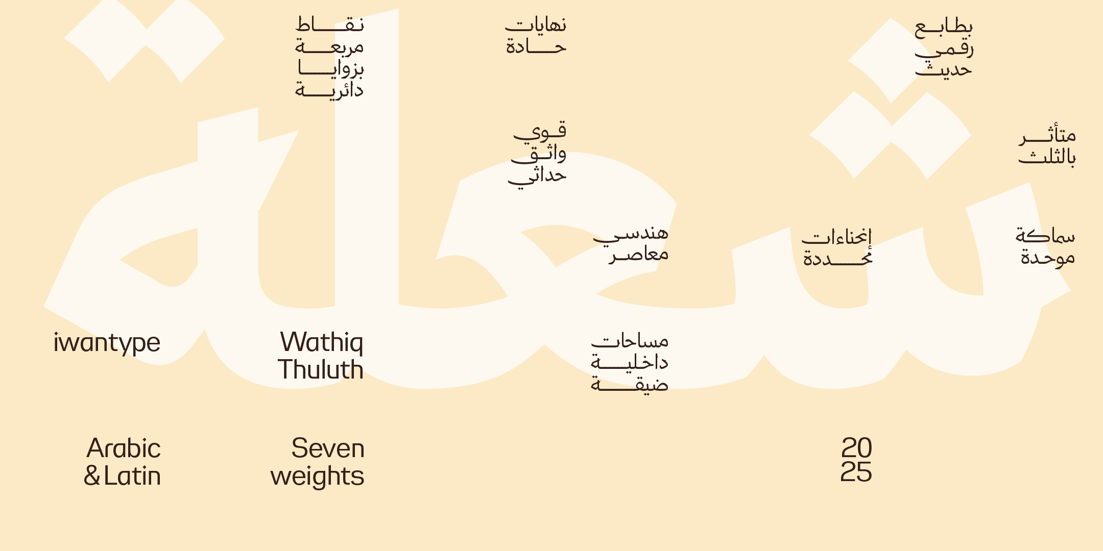
- Wathiq Thuluth — the legibility of Naskh with the grandeur of Thuluth compositions and extensions.
- Ghroob Geometric — a clear, balanced geometric construction in seven weights, and one of the richest typefaces in the collection for OpenType features.
- Qomra — a Mastari Naskh that combines simplicity and elegance, in five weights from Light to Black.
- Asal — a geometric structure with alternates and ligatures.
For the full details and a role-by-role comparison of each typeface, read Arabic fonts for brand identity: how to choose and where to start.
And if you are ready to buy, review the three license types and what each one covers.
❓ Frequently asked questions
How many weights does a brand identity need?
Three is a practical minimum: light for details, regular for text and heavy for headlines. Four or five give you more flexibility without chaos.
One typeface or two in an identity?
Start with one, and add a second only when the first can’t handle a specific job. That often happens when the logo typeface has high contrast and doesn’t work for text.
Is a free font suitable for a commercial brand identity?
There are free and open-source Arabic fonts with large families, so price alone can’t settle the question. Check the weights, languages, features and license, and how much distinctiveness the identity needs. An identity meant to last for years deserves a firmer foundation.