As contemporary Arabic typefaces spread, one question keeps coming up: does modernizing the letterforms mean losing their identity? Does modern simplicity mean drifting away from their roots?
Some people tie authenticity to strict classical form and see any simplification as a concession.
But the reality is more complex.
Modernity is not a rupture but a reinterpretation.
🏛️ Authenticity is not a fixed form
The classical styles grew out of contexts entirely different from ours. They were written by hand, read in manuscripts and displayed in different kinds of spaces.
But authenticity was never about “form alone.” It was about:
- Respecting the logic of the letter
- Preserving rhythm
- Understanding proportion
- Grasping the spirit of the script
As long as these remain, renewal does not cost a typeface its authenticity.
💻 The medium changed, so the letter had to change too
Today we read on:
- Small screens
- Fast-paced apps
- Crowded interfaces
- Ever-changing digital environments
Some levels of calligraphic complexity do not suit every digital use or every small size, although some modern digital typefaces still handle that complexity with real skill.
Simplification here is not a concession but a natural response to a change of medium.
⚖️ The difference between evolution and distortion
There is a big difference between:
- Evolution built on understanding
- Distortion born of disregard
Evolution preserves the essence of the letter and retunes its details for modern use.
Distortion, on the other hand, breaks the proportions, weakens the rhythm and erodes the identity.
Awareness is what makes the difference.
🔄 The hybrid typeface as a balanced solution
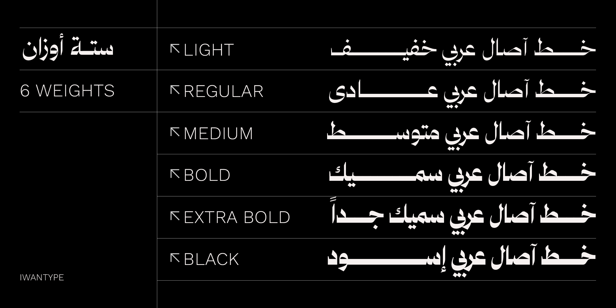
Many modern typefaces draw on classical schools but recast them with a more geometric or clearer structure.
Here the past is neither copied nor ignored.
Instead, the aim is to:
- Keep its spirit
- Update its structure
- Adapt it to the present day
That is what makes a typeface contemporary and authentic at the same time.
🎯 Authenticity is a feeling, not ornament
We sometimes associate authenticity with abundant detail and ornament. But a deep identity does not depend on complexity.
A typeface can be very simple and still carry a distinctly Arabic spirit.
Authenticity lies not in the number of curves but in the honesty of the construction.
🧠 What should designers ask themselves?
When choosing a modern typeface, ask:
- Does it respect the logic of the Arabic letter?
- Does it preserve the internal rhythm?
- Does it look foreign to an Arabic reader’s eye?
- Or does it look modern yet familiar?
If it feels familiar despite being modern, it is most likely connected to its roots.
🖋️ At Iwan Type
We believe true modernity does not shut out the past. It builds on it.
We look for typefaces that are contemporary yet readable, balanced and connected to the spirit of the Arabic letter.
Because authenticity is not the opposite of evolution. It is part of it.
🗂 From the collection
A selection from the Iwan Type collection:
- Wathiq Thuluth — Naskh legibility with the grandeur of Thuluth compositions and extensions.
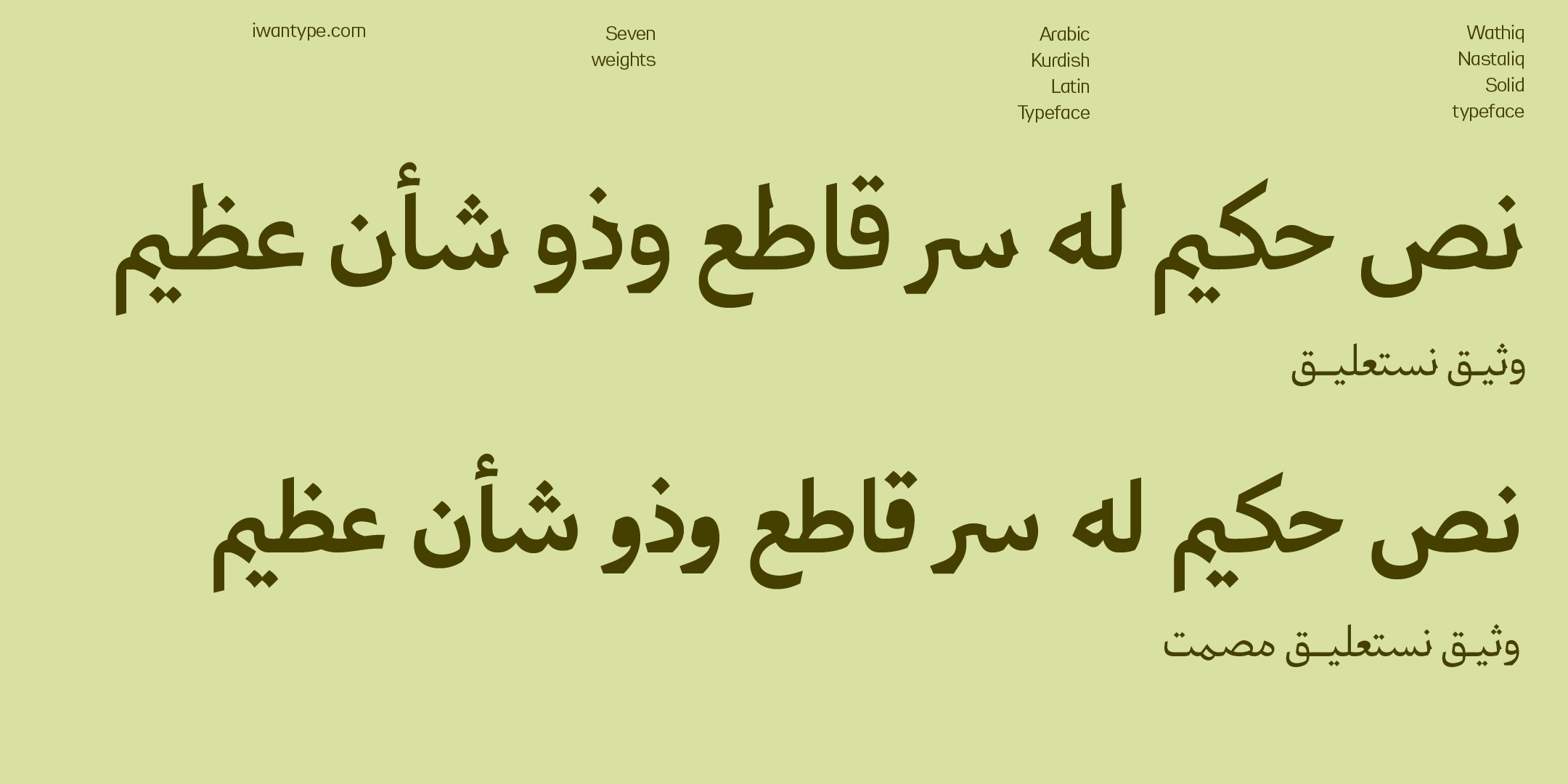
- Wathiq Nastaliq — the grace of Nastaliq with the legibility of Naskh, in a calm interpretation.
- Ghroob Nastaliq — a contemporary treatment that brings together Naskh structure and the spirit of Nastaliq, with a geometric approach.
- Asal — a geometric structure with alternates and ligatures.
To compare the license types and what each one covers, see commercial licenses for Arabic fonts.
❓ Frequently asked questions
Does modern Arabic type mean giving up authenticity?
No. Authenticity is not a fixed form but a logic: proportions, rhythm and a way of handling space. A good modern typeface keeps that logic and rebuilds it for the demands of the new medium.
What is the difference between evolution and distortion?
Evolution keeps the logic of the style and adapts its form. Distortion changes the proportions and rhythm until the typeface no longer belongs to its style, without gaining any new function.