Arabic script has never stopped evolving. From its classical beginnings in manuscripts, through lithographic printing, to the digital age, it has always been in a state of change.
One of the most notable trends of recent decades is a widening space for experimentation and reinterpretation, alongside schools that remain committed to the classical rules. It is one trend among several, not an inevitable stage.
Contemporary Arabic type is not a break with the past but a rereading of it.
🏛️ The classical stage: the rule comes first
Classical styles such as Naskh, Thuluth and Diwani were built on a precise system of proportions, angles and extensions. The aim was disciplined beauty, ideal balance and respect for the rule.
At this stage:
- Each letter is governed by clear rules
- Extensions are precisely calculated
- The rhythm is stable
- Ornament is part of the structure
Beauty was bound up with adherence to the rules.
🖨️ The print stage: adapting to the medium
With the arrival of printing, the equation changed. Letters were no longer only written by hand. They were cast in molds and reproduced thousands of times.
This posed new challenges:
- Simplifying some details
- Adjusting stroke thickness
- Reducing ornamental complexity
- Keeping text legible at small sizes
Before print, calligraphy was never ornament without function: the manuscript was, above all, a means of communication and preservation. What print changed was the kind of demands: from perfecting a single copy to a discipline that could withstand mechanical repetition.
💻 The digital age: flexibility and speed
The shift to digital brought new needs:
- Screens of different sizes
- Interactive interfaces
- Fast reading
- Constantly changing apps
The classical rules alone were no longer enough for every new use, so many designers rethought the shape of the letter, while other digital typefaces went on carrying the full calligraphic complexity.
Legibility became a priority, and flexibility a necessity.
🔄 The rise of the hybrid typeface
This is where the era of hybrid typefaces began.
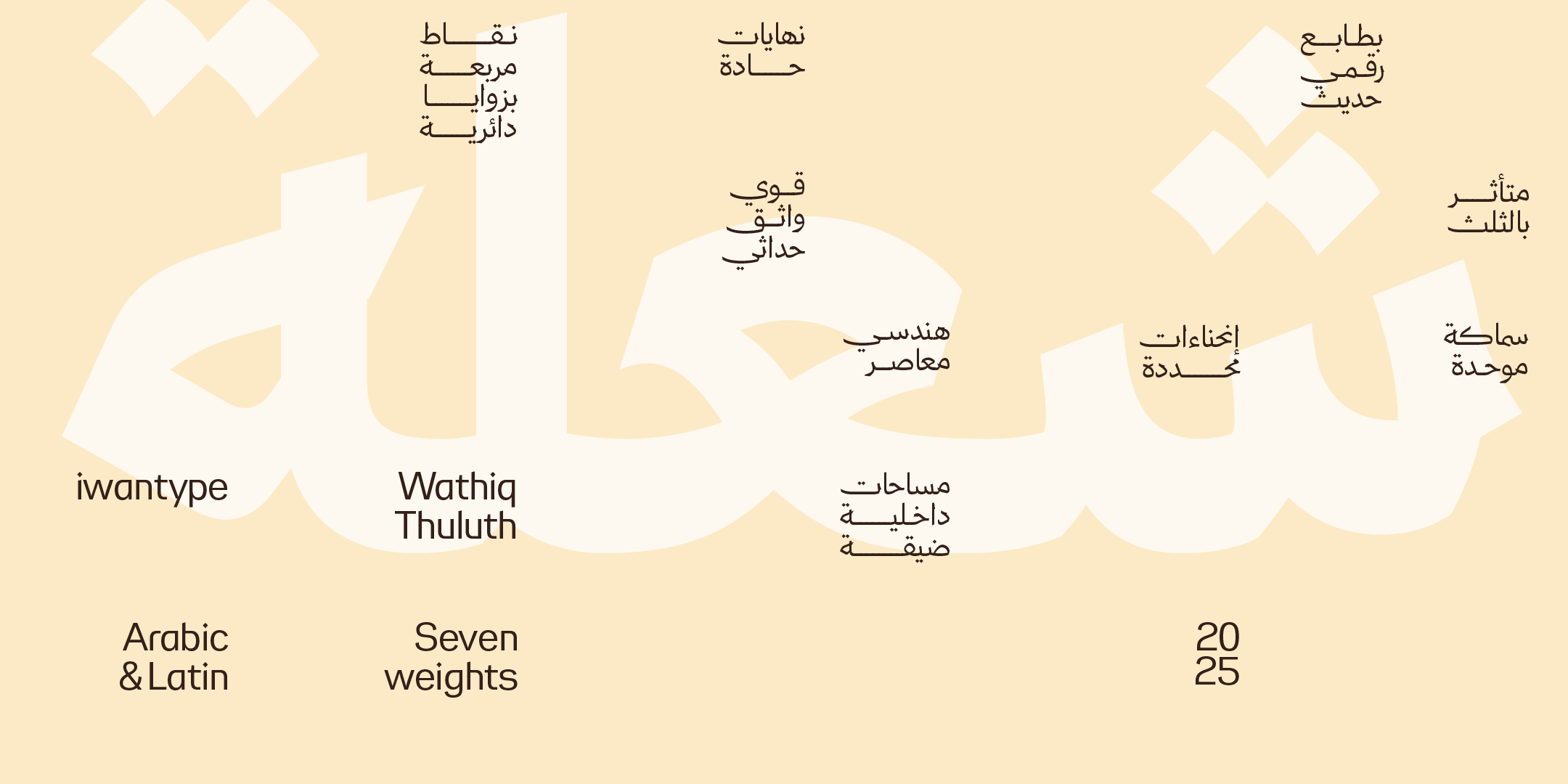
They draw on Naskh, simplified for today. They allude to Thuluth, without its heavy ornament. They borrow the spirit of Ruqaa, with a more precise geometric structure.
A hybrid typeface does not belong entirely to one school. It strikes a balance between heritage and modernity.
⚖️ The challenge: how do we preserve identity?
Renewal carries two risks:
- Moving too far from the roots
- Or clinging rigidly to the past
Successful contemporary Arabic type:
- Respects the logic of the letter
- Preserves the rhythm
- Simplifies without draining the meaning
- Innovates without severing its ties to history
The balance here is a fine one.
🎯 Why do we need hybrid typefaces today?
Because contemporary projects need:
- Legibility on screen
- Visual presence
- A clear Arabic identity
- Flexibility in use
A hybrid typeface makes that possible. It is modern, but familiar. Contemporary, but not foreign.
🧠 Contemporary type is not a fad
Some designers treat contemporary type as a passing trend. In our view, though, it is a natural result of changing media and contexts.
Just as the script evolved with print, it had to evolve with the screen.
Evolution is not a departure from identity but a continuation of it in a new form.
🖋️ At Iwan Type
We believe contemporary Arabic type does not start from scratch. It starts from a deep understanding of the classical.
We seek a balance of roots and function, of historical rhythm and modern legibility.
Because the future is not built by cutting ties with the past, but by reinterpreting it thoughtfully.
🗂 From the collection
A selection from the Iwan Type collection:
- Wathiq Thuluth — Naskh legibility with the grandeur of Thuluth compositions and extensions.
- Wathiq Nastaliq — the grace of Nastaliq with the legibility of Naskh, in a calm interpretation.
- Wathiq Ruqaa — the spirit of Ruqaa with a balanced geometric structure.
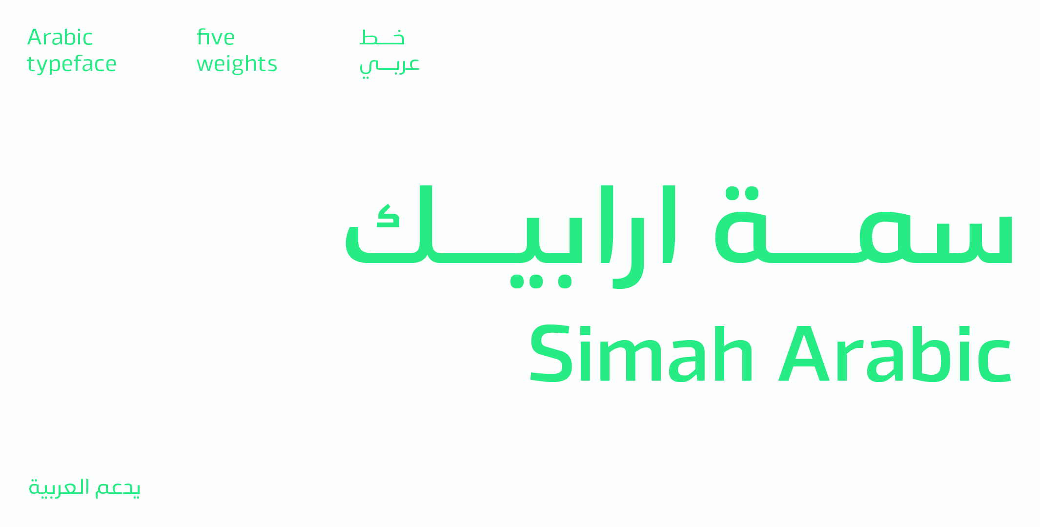
- Simah — simplicity and legibility with a human spirit.
To compare the license types and what each one covers, see commercial licenses for Arabic fonts.
❓ Frequently asked questions
What are the stages in the evolution of contemporary Arabic type?
It runs from the classical stage, where the calligraphic rule came first, to the print stage and its adaptation to the medium, to the digital age, which demanded flexibility and speed, and then to the rise of the hybrid typeface, which blends the two logics.
What is a hybrid typeface?
A typeface that distills the logic of a traditional style, its proportions and rhythm, and rebuilds it on the rules of digital typography instead of copying its forms as they are.