A logo can look balanced in concept, symbol and colors, and still fail to establish itself.
Sometimes the problem is not the symbol or the colors. It is the type, before anything else.
The type in a logo is not a cosmetic detail. It is the core of the message.
🧩 Type is the first thing people read
In many Arabic logos, the word is the main element, not the symbol.
If the typeface is wrong, the whole logo falters.
A weak typeface makes the brand look unsure of itself. An overdone one makes it look affected. A hard-to-read one confuses the reader from the very first moment.
⚖️ A typeface that does not match the brand personality
Imagine a law firm set in a very playful typeface. Or a youth brand in a stern, heavy one.
The contradiction may not be obvious straight away, but it weakens the logo’s credibility.
A successful logo is one in which the idea matches the visual tone. And the typeface is what carries that tone.
📉 A beautiful typeface does not guarantee a successful logo
Some designers choose a highly distinctive typeface to give the logo a strong presence. But too much detail can do more harm than good.
A logo needs:
- Legibility at small sizes
- Cohesion in print
- Simplicity that allows repetition
A typeface full of fine details can lose its strength when scaled down.
🔍 Weak balance within the word
In Arabic script especially, the rhythm between letters is essential.
If some letters are heavier than others for no considered reason, or the balance between masses and spaces is off, the word looks unstable, even if the viewer cannot tell why.
A logo should hold together as a single unit, not read as a collection of separate letters.
🧪 Ignoring usability
A logo does not live only in a design file. It appears on:
- Cards
- Interfaces
- Apps
- Signs
- Small screens
If the typeface is not flexible enough to work in these settings, the logo fails in practice, even if it looks beautiful in theory.
🎭 Type contributes to a sense of trust
Trust does not come from the symbol alone. Type is one of the biggest factors in whether a brand looks stable or unsettled.
A balanced typeface gives a sense of steadiness. An undisciplined one makes the logo look temporary or ill-considered.
And in an identity, feeling matters more than ornament.
🧠 What makes a typeface work in a logo?
A typeface that works in a logo:
- Reflects the brand personality
- Stays legible at every size
- Has internal balance
- Does not depend on fragile details
- Serves the idea instead of overpowering it
A logo is not a place to show off typography. It is a concentrated point of focus.
🖋️ At Iwan Type
We believe a logo begins with the letter, and that the type within it is not an optional element.
Choosing a logo’s typeface is a strategic decision, because it determines how the brand will speak every time it is seen.
And sometimes… the difference between a successful logo and a weak one is a single typeface.
🗂 From the collection
A selection from the Iwan Type collection:
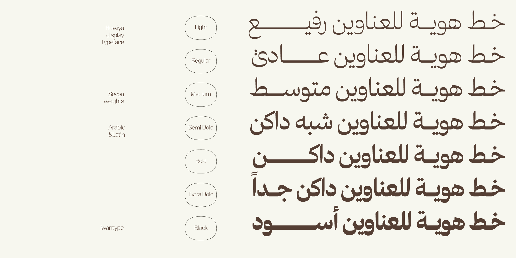
- Huwiya Display — a display typeface with generous counters and curves that lean toward the square.
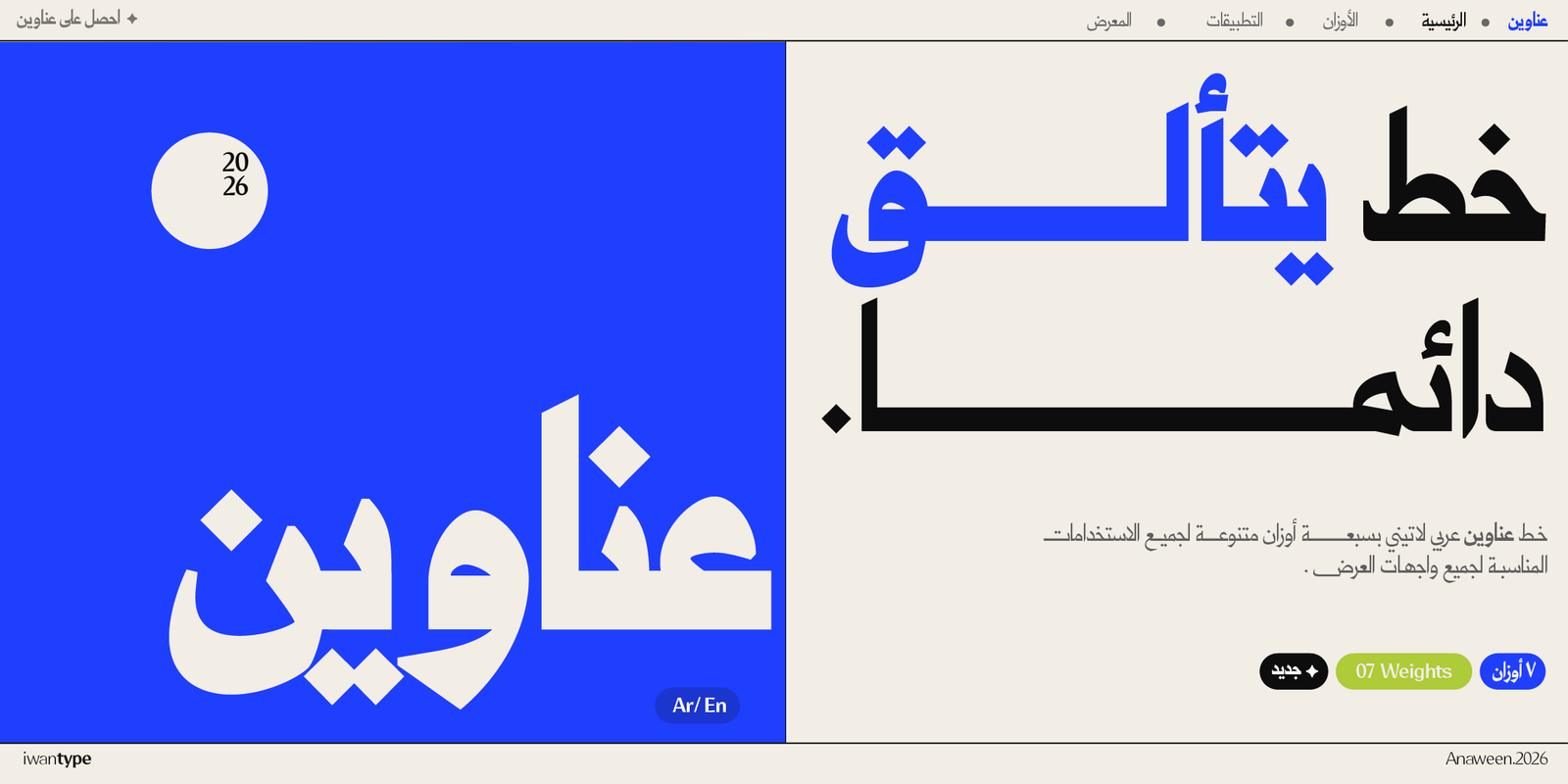
- Anaween — tall vertical proportions and tight spacing, drawn from the tradition of newspaper and advertising type.
- Iwan Zaza — high contrast with a Kufi spirit and a Naskh influence.
- Wathiq Thuluth — Naskh legibility with the grandeur of Thuluth compositions and extensions.
To compare the license types and what each one covers, see commercial licenses for Arabic fonts.
❓ Frequently asked questions
Why do some logos fail because of their typeface?
Because type is the first thing people read, so a typeface that does not match the brand personality sends a message that contradicts it. Weak balance within the word also makes a logo look unprofessional, however beautiful the typeface is in itself.
What makes a typeface work in a logo?
It matches the brand personality, the word is visually balanced once the spacing has been adjusted, and it can be scaled down without losing legibility.