The question may sound simple, but many design mistakes start from a false assumption: that a good typeface works for any project.
The reality is completely different. Not every typeface suits every context.
A typeface can be excellent and still be wrong for the place it has been put.
🧩 A good typeface isn’t a universal one
Some typefaces are designed to be calm and steady; others are designed to be striking and bold.
A typeface that excels in a quiet cultural identity can fail in a loud youth campaign.
And a typeface that is powerful in a commercial ad can look overblown inside a formal institution.
A typeface’s quality doesn’t make it universal.
🎭 The nature of the project sets the terms
Every project has:
- A personality
- An audience
- A tone
- A context of use
A banking project needs trust and stability. A tech project needs clarity and modernity. A creative project may need flexibility and energy.
The right typeface reflects these elements, rather than simply pleasing the designer.
📄 Functional context matters
Sometimes a typeface fits in character but isn’t practical in use.
Does the project rely on long texts? Will it appear in small digital applications? Does it need multiple weights?
A beautiful typeface with limited uses can hold the project back later.
⚖️ Balancing distinctiveness and stability
Some designers chase distinctiveness at any cost. They pick a very unusual typeface to make an obvious difference.
But too much distinctiveness can turn into a burden. An identity sometimes needs stability more than spectacle.
The right typeface strikes a balance between personality and practicality.
🧠 How can you tell a typeface doesn’t fit?
There are clear signs:
- The audience senses a contradiction with no clear reason
- The text looks tiring or unstable
- It is hard to build a coherent typographic system
- The feel changes from one application to the next
At that point, the problem lies not in the execution but in the original choice.
🎯 The right decision is not the most eye-catching one
Choosing a typeface is not about asking, “Is this a beautiful typeface?”
It is about asking, “Does this typeface serve this particular project?”
The difference between those two questions is the difference between good design and mature design.
🖋️ At Iwan Type
We believe every typeface has its proper place. A good typeface is not one that works for everything, but one that works honestly in the setting it is suited to.
Choosing a typeface is a decision about context, not an absolute verdict on quality.
🗂 From the collection
A few examples from the Iwan Type collection:
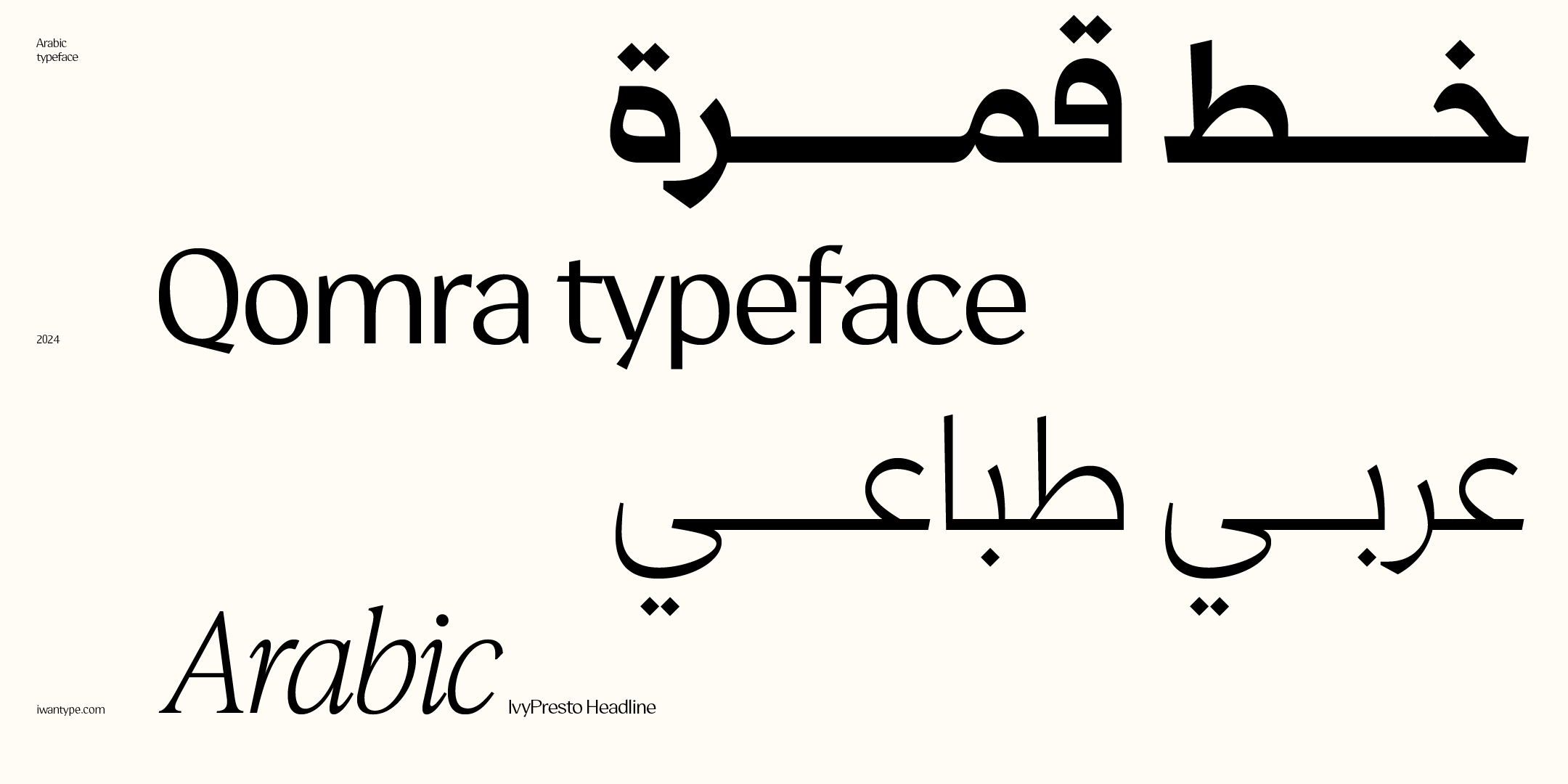
- Qomra — a Mastari Naskh that combines simplicity and elegance, in five weights from Light to Black.
- Wathiq — a modern Naskh with strong letterforms and carefully controlled counters, in seven weights and both scripts.
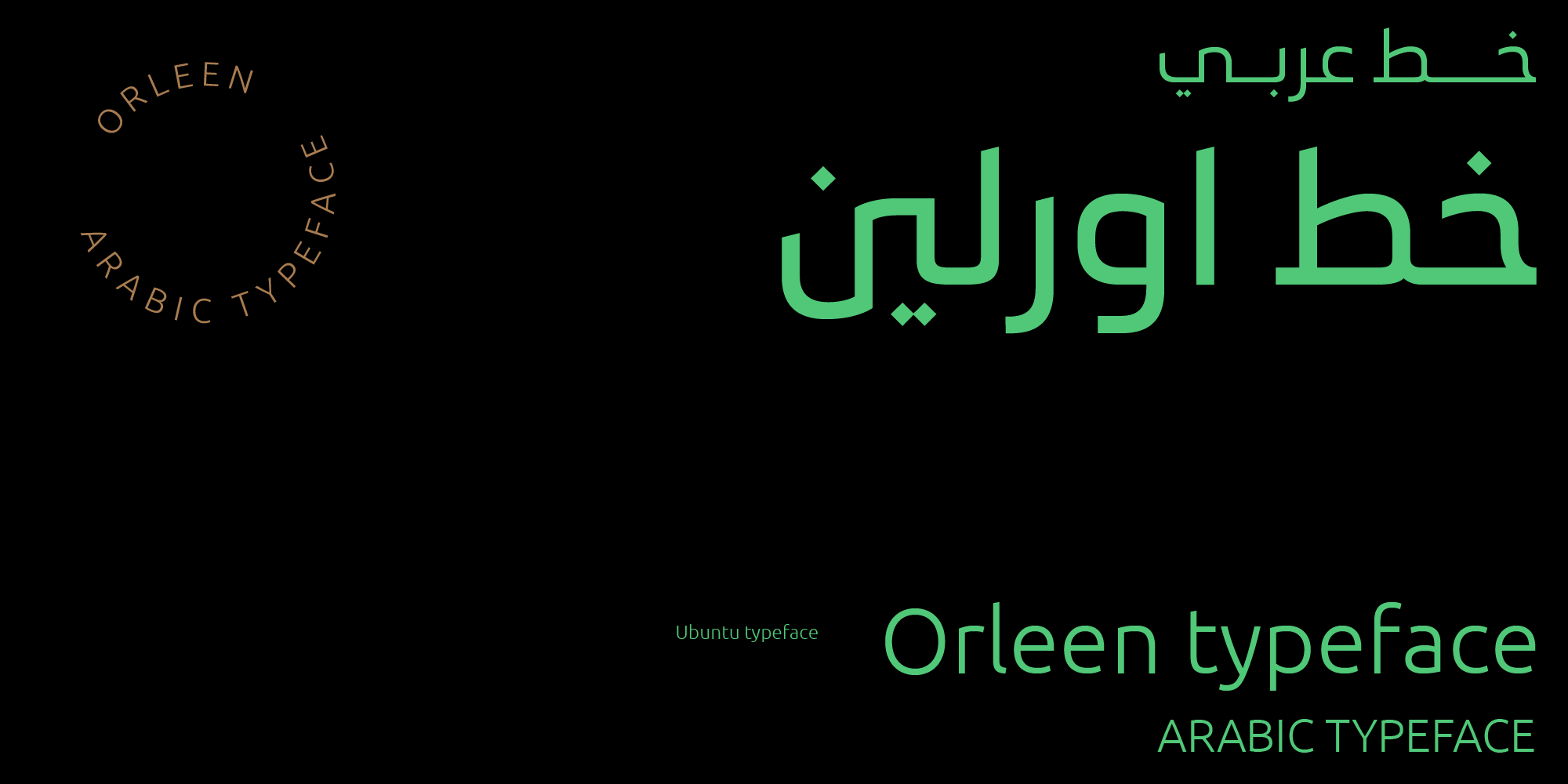
- Orleen — elegant and modern, with a Kufi spirit.
- Wathiq Thuluth — the legibility of Naskh with the grandeur of Thuluth compositions and extensions.
To compare the license types and what each one covers: Buying Arabic fonts with a commercial license.
❓ Frequently asked questions
Does every font work for every project?
No. A good typeface isn’t a universal one: every typeface has a field where it performs best. A display typeface is often not optimized for paragraphs, and a simple text typeface can look weak in a headline that needs presence.
How do I know a typeface is wrong for my project?
Test it in your hardest use, not your easiest: the smallest text, the longest word and the most crowded context. If it survives, it’s the right fit.