One of the most common reasons a design feels uncomfortable is the wrong kind of typeface in the wrong place. Many designers choose type by its looks, without thinking about what it is there to do.
Not every typeface suits every use.
This is where the difference between text typefaces and display typefaces comes in.
📄 What is a text typeface?
A text typeface is designed to be read for long stretches. Its main job is legibility and visual stability.
It typically has:
- Simple details
- Balanced stroke weights
- Clear letterforms
- A comfortable visual rhythm
This kind of typeface doesn’t try to draw attention. It works quietly in the service of the content.
If you have long paragraphs, articles or informational content, a text typeface is the natural choice.
🎯 What is a display typeface?
A display typeface is designed to be seen quickly and to leave a strong visual impression. It often has bolder details or higher stroke contrast.
It is typically used for:
- Main headlines
- Logos
- Advertising campaigns
- Storefronts
A display typeface catches the eye, but it is often not optimized for extended reading.
⚖️ When does the problem arise?
The problem starts when:
- We use a display typeface for long paragraphs
- Or we use a very plain text typeface for a headline that needs a strong presence
In the first case, the eye gets tired. In the second, the impact weakens.
The wrong choice doesn’t ruin the typeface. It ruins the context.
👁️🗨️ How can you tell them apart quickly?
Ask yourself:
- Do the letters have a lot of eye-catching detail? It’s most likely a display typeface
- Is the typeface steady and comfortable in paragraphs? It’s most likely a text typeface
- Can you read a full page in it without strain? That’s a text typeface
- Does it make an instant impression in a single word? That’s a display typeface
A quick test reveals the difference.
🔄 Can you combine them?
Yes, and in many projects it is the ideal solution.
A display typeface for headlines and a text typeface for body copy.
Together, they strike a balance between appeal and readability.
But pay attention to:
- Similar proportions
- A shared rhythm
- Compatible overall stroke weight
The goal is not variety but integration.
🧠 Always remember
A text typeface serves reading. A display typeface serves impact.
Once you know what each one is for, you stop choosing at random and start building a balanced visual system.
🖋️ At Iwan Type
We believe a good typeface is measured by how well it fits its purpose, not just by how bold it is.
That is why we design typefaces with a clear role: to serve reading, to create impact, or to balance the two deliberately.
🗂 From the collection
A few examples from the Iwan Type collection:
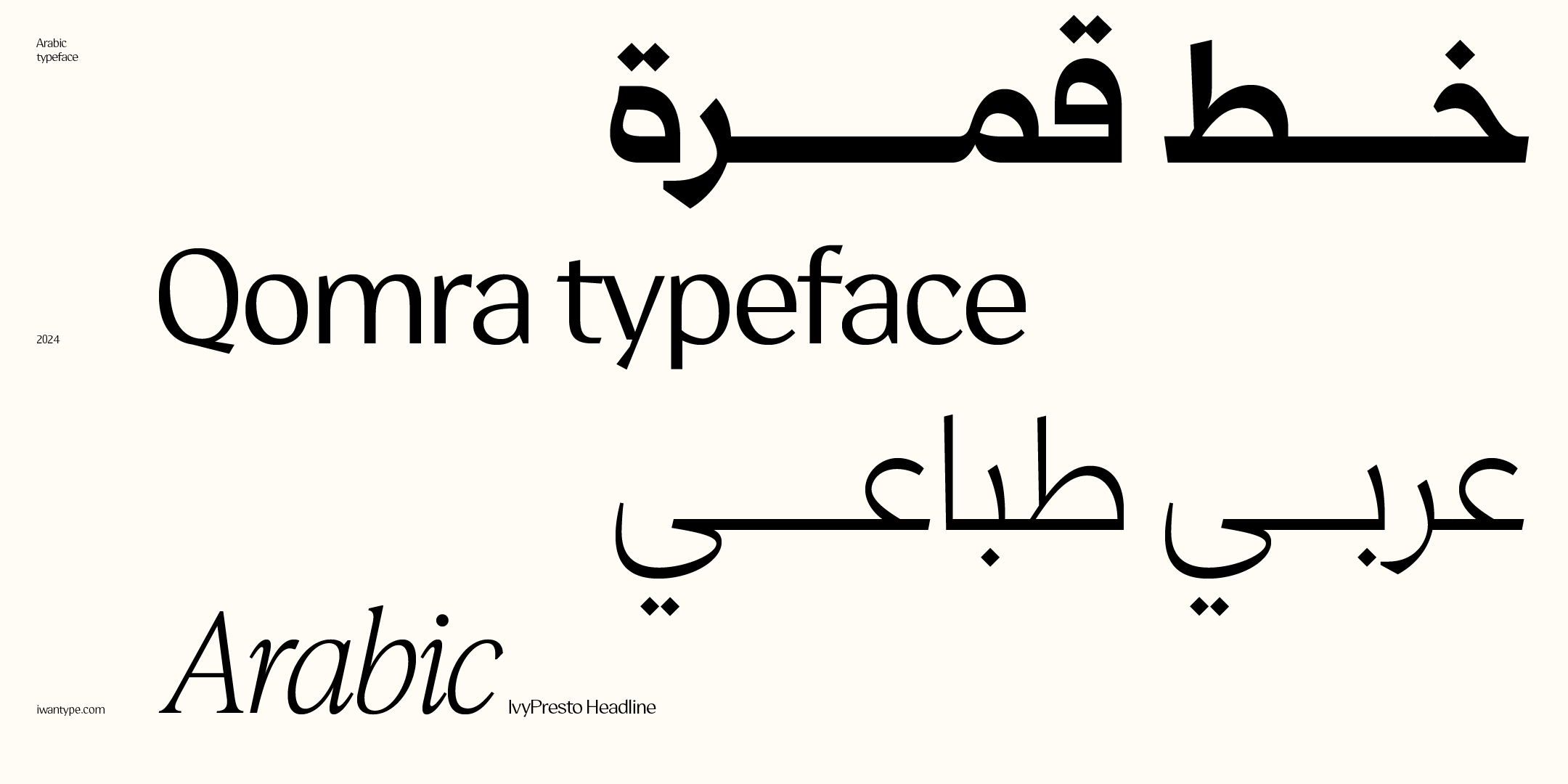
- Qomra — a Mastari Naskh that combines simplicity and elegance, in five weights from Light to Black.
- Omnia Naskh — a modern Naskh with deliberate simplicity and clean lines, in seven weights.
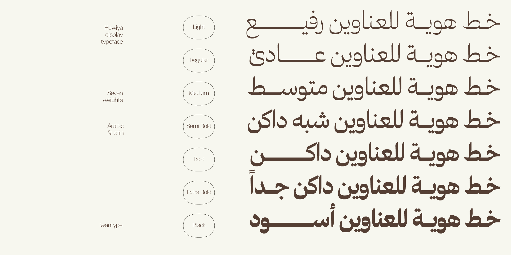
- Huwiya Display — a display typeface with generous counters and curves that lean toward the square.
- Anaween — tall vertical proportions and tight spacing, drawn from the tradition of newspaper and advertising type.
- Omnia Display — a display typeface with a contemporary personality.
To compare the license types and what each one covers: Buying Arabic fonts with a commercial license.
❓ Frequently asked questions
What is the difference between a text typeface and a display typeface?
A text typeface is designed to be read for long stretches: simple details, balanced stroke weights and clear letterforms. A display typeface is designed to be seen quickly and leave a strong visual impression, with bolder details and higher contrast.
Can I use a display typeface for paragraphs?
It is better to pair it with a text typeface. A display typeface is designed to be seen quickly and make an impression, and that is where its strength lies in a headline. For paragraphs, use a text typeface: the two together are the natural system for any identity.
How can I tell them apart quickly?
Set a full paragraph at your real text size and in your actual medium, print or screen, because the same size looks different from one typeface to another. If it stays comfortable, it’s a text typeface; if it tires the eye, it’s a display typeface.