


The problem usually starts in the identity review meeting. The Arabic logo looks good, the English logo looks good, and side by side they turn out to come from two different worlds: a different stroke weight, a different height and a completely different feel.
This is not an execution error. It comes from choosing an Arabic typeface with no Latin companion designed alongside it, then picking a separate Latin typeface because it “seems to fit.”
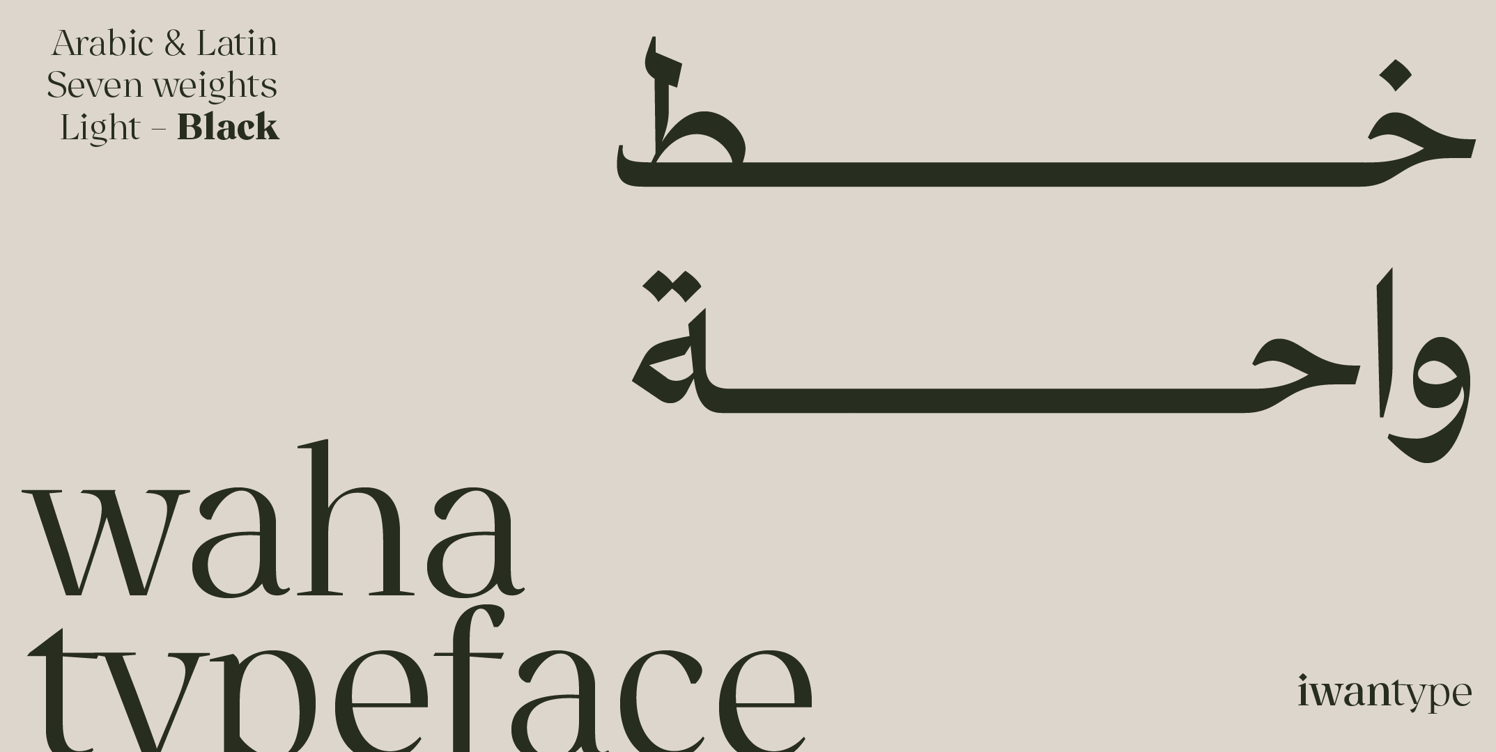
In the Iwan Type collection, many typefaces come with both scripts, among them Wathiq, Huwiya Display, Anaween, Ghroob Geometric, Salma, Maharif, Rayat (its Latin comes with the full family only), Shaheen and Waha. Language support is listed on each font page.
⚠️ Why ad hoc pairing doesn’t work
Arabic and Latin are two structurally different systems:
- Arabic letters join; Latin letters stand apart
- Arabic has a different x-height and deeper descenders
- Arabic has no capital letters, so nothing corresponds to the Latin capitals
- An Arabic word often looks denser for the same number of letters, depending on the two typefaces being compared
Set an Arabic typeface next to a Latin one without calibrating the two, and these differences show up as discord. A system of two separate, compatible typefaces can work if the proportions are tuned, but a font designed with both scripts together gets you there faster. Without that calibration, the English word looks lighter or heavier, taller or shorter, than its Arabic counterpart.
A typeface designed with both scripts solves this at the design stage rather than in production: the type designer tunes letter heights and stroke weights across the two scripts so that they read as equals.
🏢 What a business actually needs
Matching weights
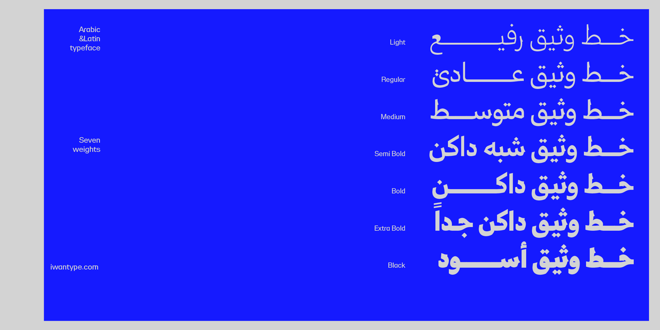
If you have seven weights in Arabic and three in Latin, your system is incomplete. Wathiq and Ghroob Geometric each offer seven weights in both scripts.
Numerals
This is the most overlooked point in corporate projects. A company’s documents are full of prices, dates, phone numbers and financial data, and it needs a clear decision: Arabic-Indic numerals (١٢٣) or Western Arabic numerals (123)? Most important, the numerals should look as if they belong to the typeface either way.
Test this before you buy: set a table with real figures and check whether they line up vertically.
Mixing scripts in a single line
Corporate Arabic text always contains Latin words: product names, technical terms, units of measurement. Take a real mixed sentence from your own documents and read it. Does your eye jump at the switch?
🧪 The real-document test
Before you approve a typeface for a company, take a real document, such as a presentation or a quarterly report, and reset the whole thing in the candidate typeface. Not a sample page: an actual document, with its tables, footnotes, figures and English product names.
In an hour, this test shows you what you might otherwise discover six months after adoption.
🔖 Browse the collection
- Arabic and English fonts — every bilingual typeface
❓ Frequently asked questions
It contains Arabic and Latin designed together, so that the weights, letter heights and overall feel match, rather than one script being attached to the other after the design is done.
Usually because the two typefaces were not designed together, so their stroke weights and heights differ. The fix is to choose a typeface that comes with both scripts, or to commission a type designer to adjust the Latin to match the Arabic.
Not with Iwan Type’s bilingual typefaces: both scripts are in the same font files and covered by the same license. The exceptions are Rayat, Rayat Round and Diwan, whose Latin comes only with the full family; their single weights and 3-weight bundles are Arabic only. What does matter is the license type (Desktop, Web or Unlimited), because that is what sets the price and the permitted use.
One thought on “Bilingual Arabic fonts for businesses: Arabic and Latin in one system”
Comments are closed.