


The first job of a headline typeface is to register fast: within moments that vary with the medium, the audience and the length of the headline, often from a distance, and while the reader is hurrying past. Everything else comes after that.
That makes the criteria for choosing one completely different from those for a text typeface.
📐 Three criteria, in this order
1. Density
A headline lives in limited space. A typeface that takes up less room for the same number of letters gives you more freedom: a longer headline, a larger size or a wider margin.
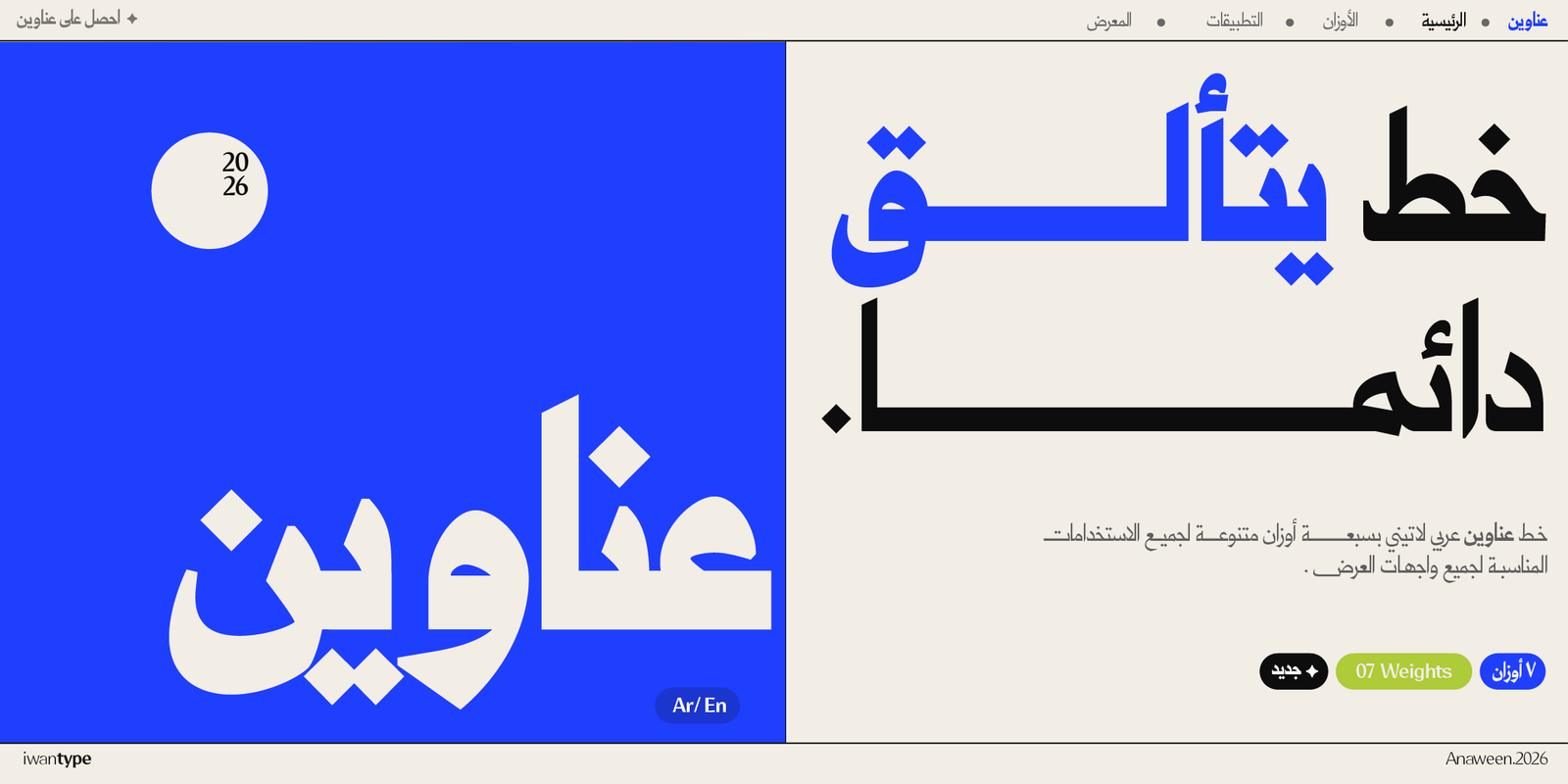
Anaween is built on exactly this logic: tall proportions and tight spacing, taken from the tradition of newspaper and advertising type, where fitting maximum density into a narrow column was a matter of economics, not aesthetics.
Wathiq achieves density another way: tight counters and strong letters.
2. Legibility at a distance
Print the headline at its real size, pin it on the wall, then step back three meters. What breaks down first?
Usually the dots. Then the letters that look alike: the ha (ح), jim (ج) and kha (خ), and the ain (ع) and ghain (غ). A good display typeface keeps those differences clear, even at small sizes on screen.
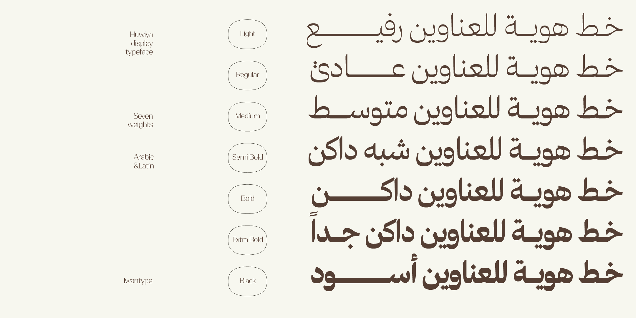
Huwiya Display is particularly strong here: its generous counters and curves that lean toward the square keep the letters open and distinct at a distance.
3. Personality
This is the last criterion, not the first. A display typeface with a strong personality that can’t be read fails at its basic job.
Salma, Rawasi Display and Iwan Zaza are options with a clear presence. Use them when the personality is the message, not when the content is.
📱 For digital headlines in particular
An Instagram ad is seen on a phone screen with a logical width of roughly 350 to 430 px, depending on the device, and often while the viewer is scrolling fast.
That means choosing moderate contrast and heavier weights, because very thin strokes need more room than a phone can give them. High-contrast typefaces belong on posters, covers and large sizes, where they are at their best. And test the headline at its actual size on a real phone, not enlarged on a computer screen.
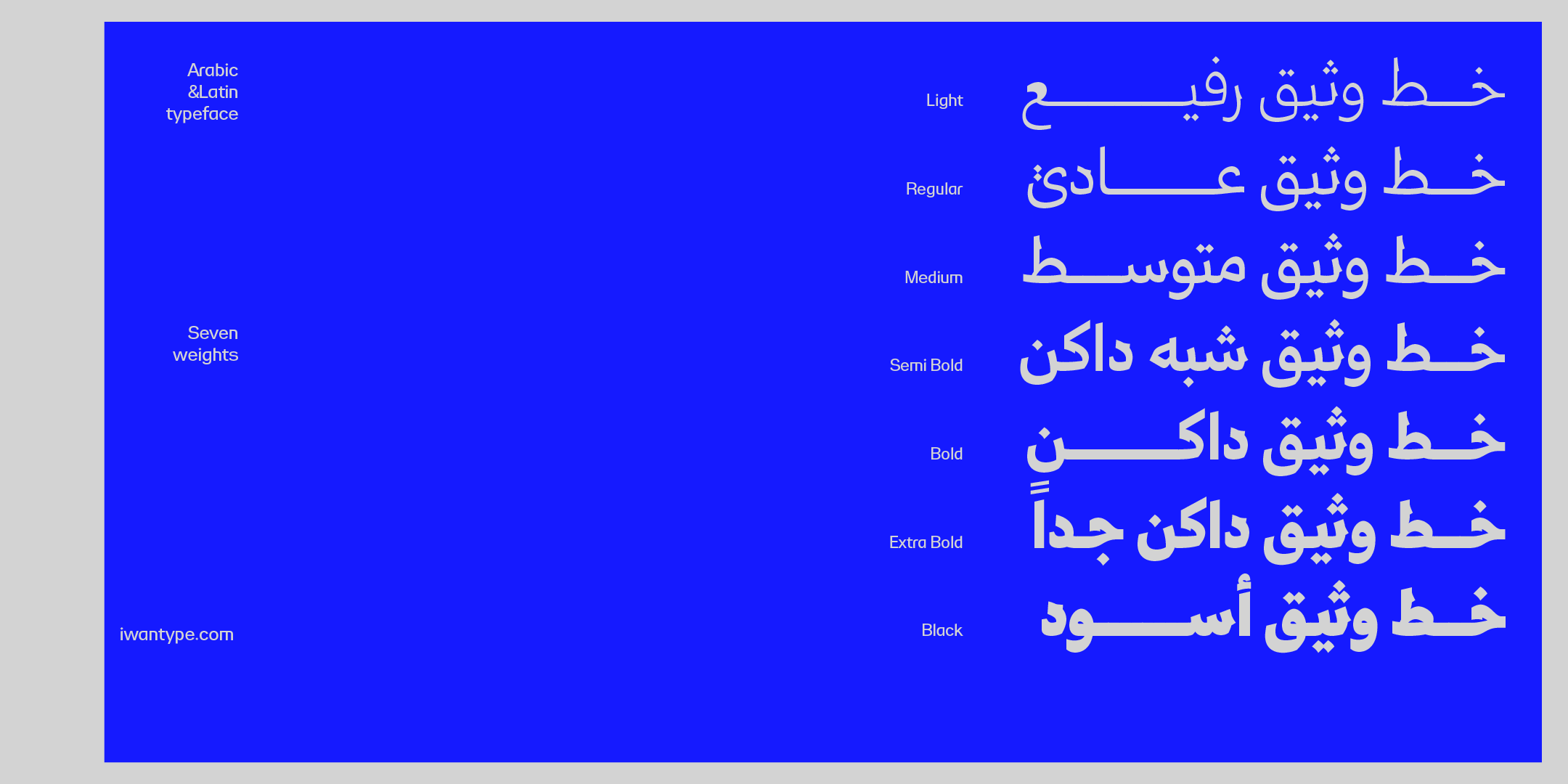
For a small screen, choose a weight that keeps details and counters clear at the actual size. That is often heavier than the weight you would use in print, but heavier is not always clearer: the Black weight can close up the counters and crowd the dots. That is why typefaces with many weights give you room to maneuver: Wathiq with seven, Qomra with five and Shaheen Pro with five.
⚠️ A common mistake: the headline typeface everywhere
Many designers fall into this trap: they choose a headline typeface, like it, and then use it for the smaller text too, “for consistency.”
The result is tiring text. Display typefaces are designed to be read quickly at a large size, not at length at a small one. Real consistency comes from a clear system, with one typeface for headlines and one for text, not from using one typeface for everything.
If you really do want a single typeface, choose one with a graded range of weights that serves both headlines and text, such as Qomra with its five weights.
🔖 Browse the collection
- Buying with a commercial license — what each license covers
- Distinctive Arabic fonts — typefaces with a strong presence
- Luxury fonts for upscale headlines
❓ Frequently asked questions
It’s better to pair it with a text typeface. Display typefaces rely on higher density and tighter counters, which is exactly what gives them their presence in a headline. For paragraphs, choose a text typeface with a graded range of weights, such as Qomra; together, the two make a complete system.
Medium and heavier weights work better on small screens. Light weights and high contrast lose their legibility when people scroll quickly on a phone.
Print it at its real size, step back three meters and watch what breaks down first: usually the dots, then the distinction between similar letters. For digital ads, view it on an actual phone at its real size, not enlarged on a computer.
One thought on “Arabic fonts for headlines and ads: how to choose a typeface that works in two seconds”
Comments are closed.