


The word “Naskh” is now applied to almost any Arabic typeface that isn’t Kufi, and that makes choosing harder, not easier. Search for a “modern Naskh font” and you’ll find typefaces that could hardly be more different: some stay close to traditional calligraphic Naskh, while others keep nothing of it but the logic of how the letters connect.
🔍 What makes Naskh “modern”
Traditional Naskh was born of the hand and the pen: stroke thickness that shifts with the angle of the reed pen, extensions that fill the line, and ligatures that take shape according to the letters before and after them.
Modern Naskh rebuilds that logic for print and screen. In practice, that means three changes:
- Disciplined widths, so words have an even density and don’t stretch at random
- A graded range of weights instead of a single weight set by the width of the pen
- Simplified ligatures, so the letters work in sequences the calligrapher never encountered, such as foreign names and technical terms
This simplification is not a compromise. It is what prepares a typeface to carry a long report, although real reading comfort also depends on size, spacing and medium, not on the letterforms alone.
🗂 Naskh typefaces in the collection
In no particular order and with no favorites: each typeface is a different way into modern Naskh, and the collection goes beyond these examples:
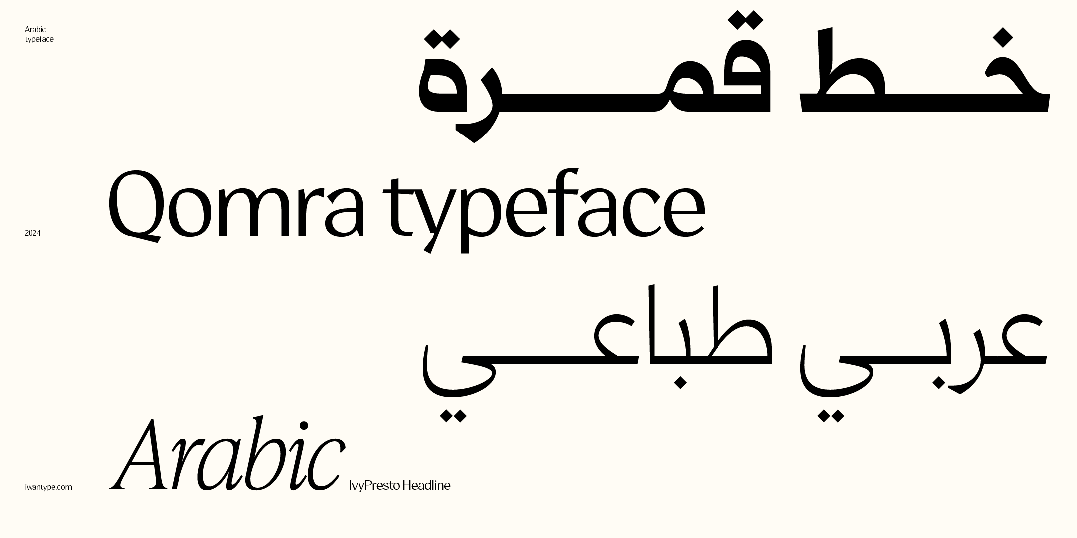
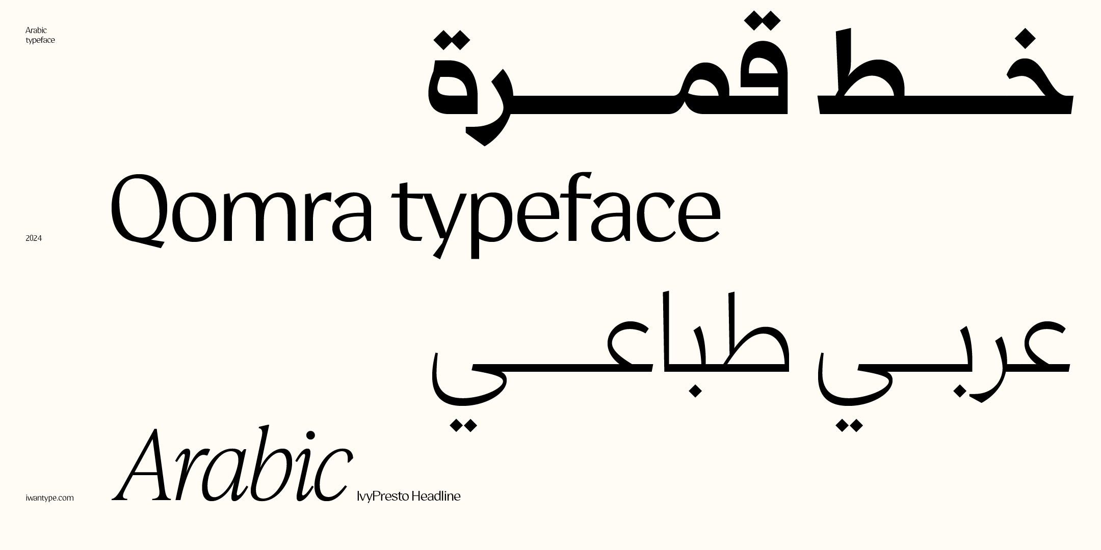
Qomra — a Mastari Naskh that combines simplicity and elegance with clear details, ideal for a wide range of uses.
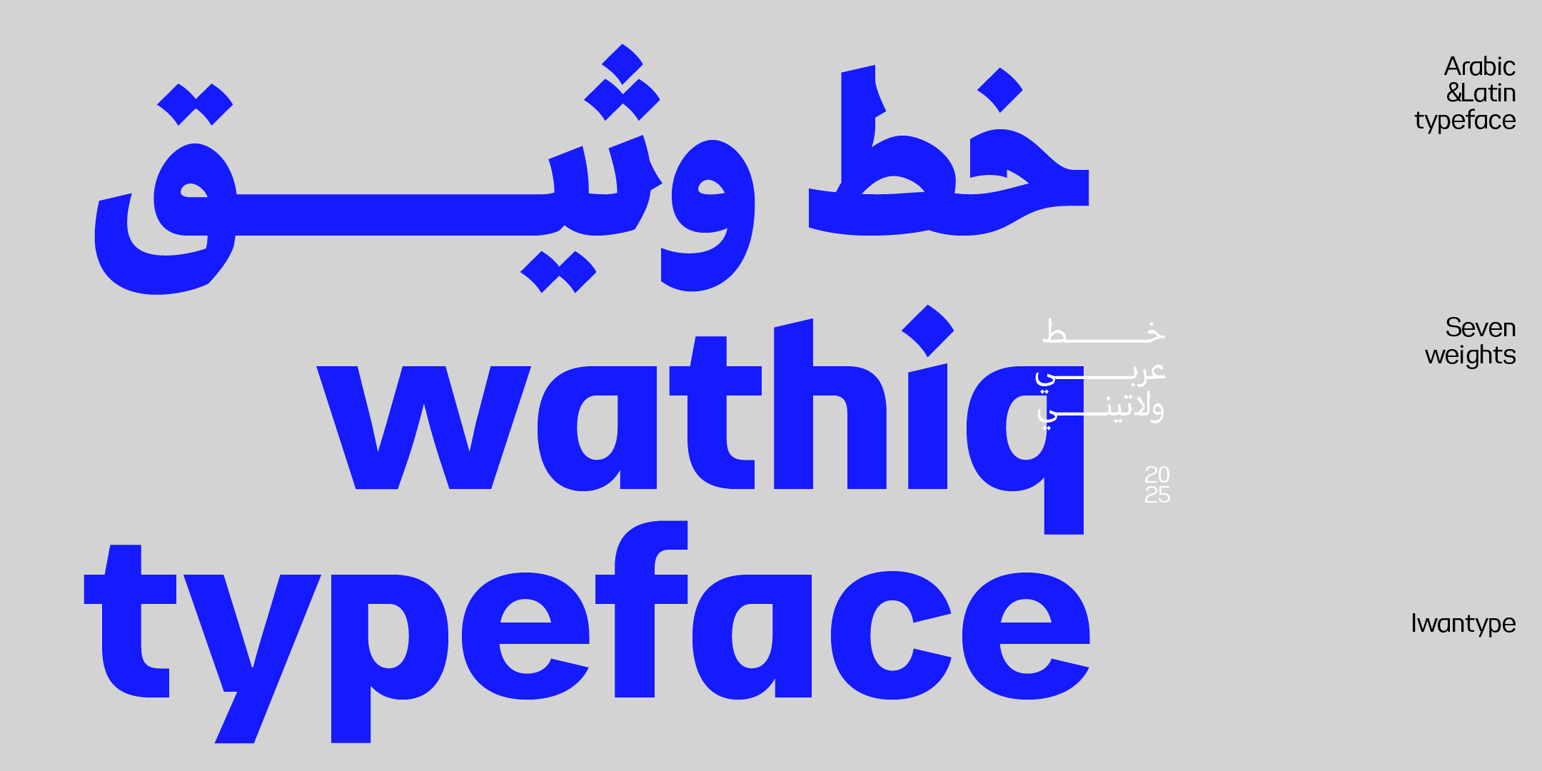
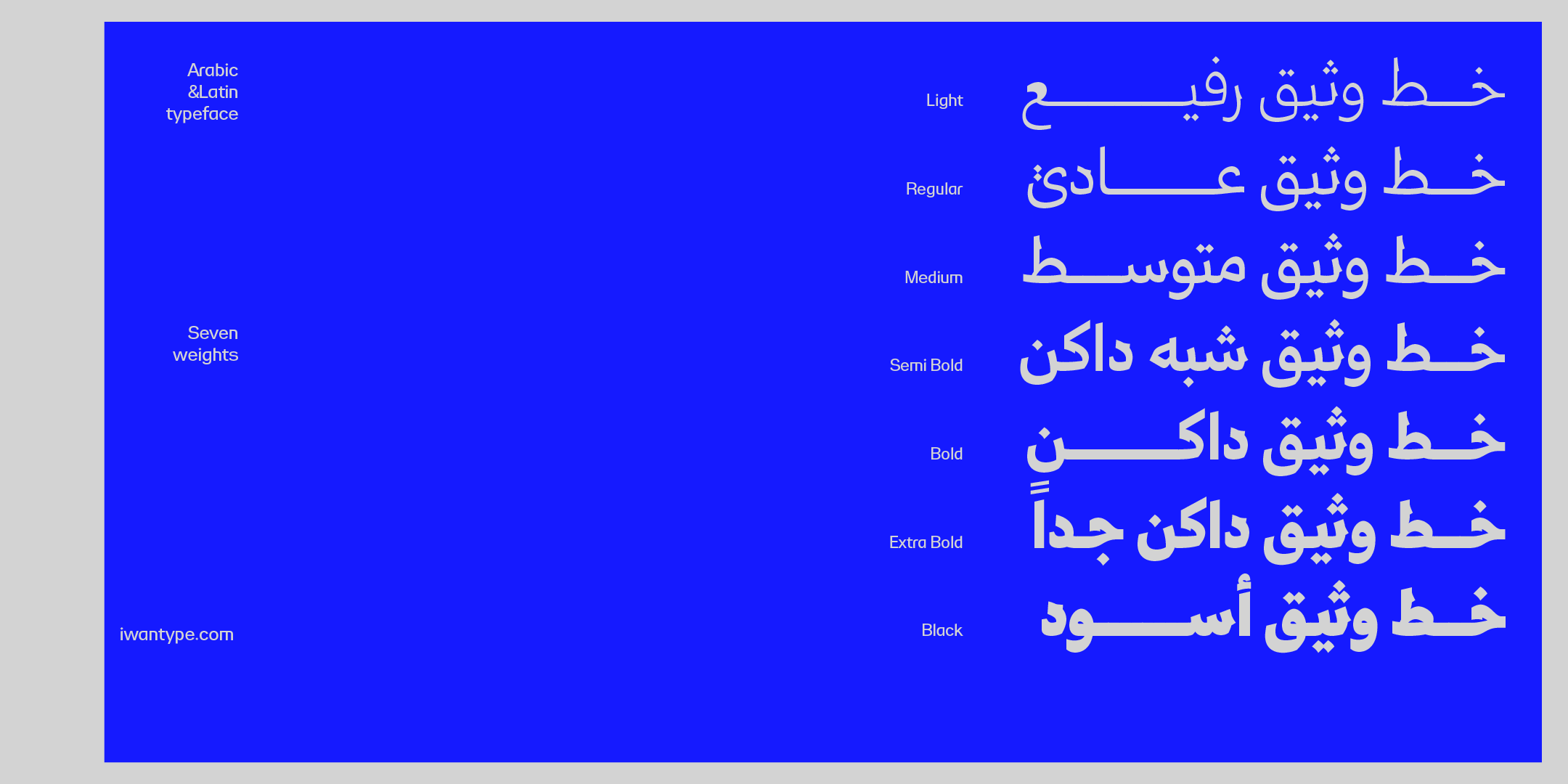
Wathiq — an Arabic–Latin typeface inspired by Naskh with touches of Thuluth: strong letters and tight counters, in seven graded weights.
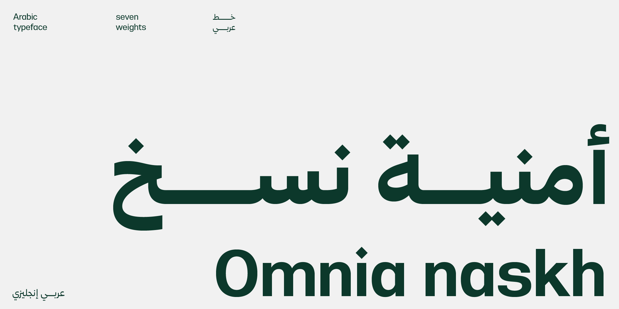
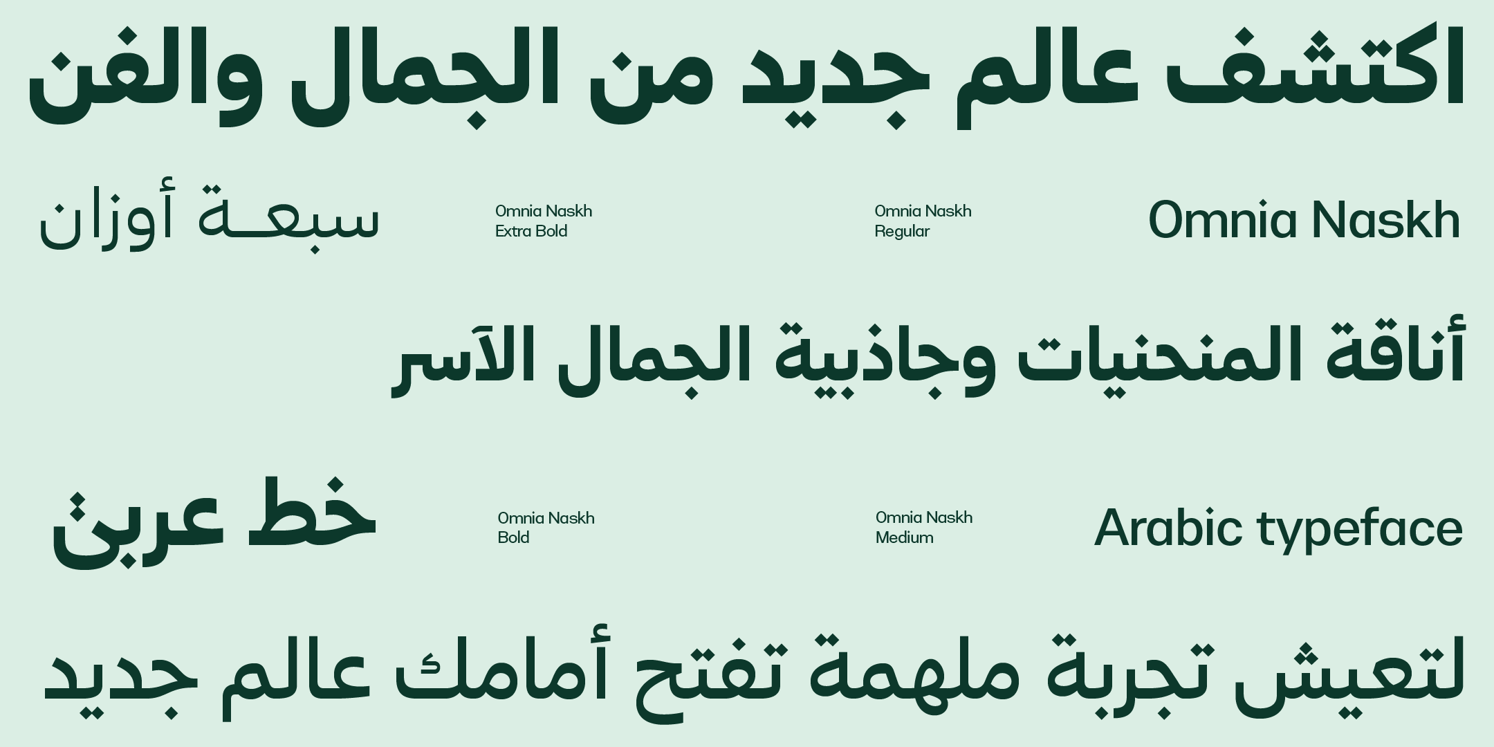
Omnia Naskh — a modern Naskh with deliberate simplicity and clean lines, in seven weights.
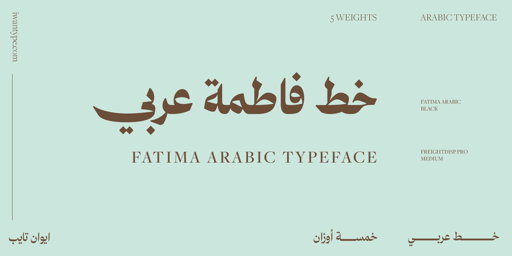
Fatima — inspired by Naskh, with high contrast and striking proportions, plus ligatures and stylistic sets.
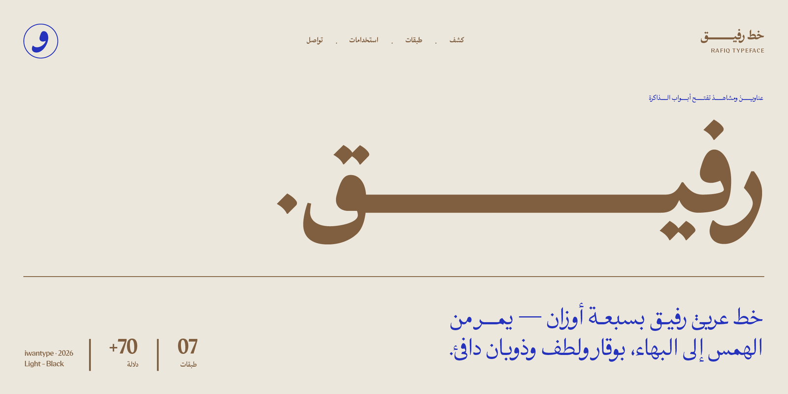
Rafiq — a contemporary Naskh that pairs sober letterforms with the warmth of quiet details.
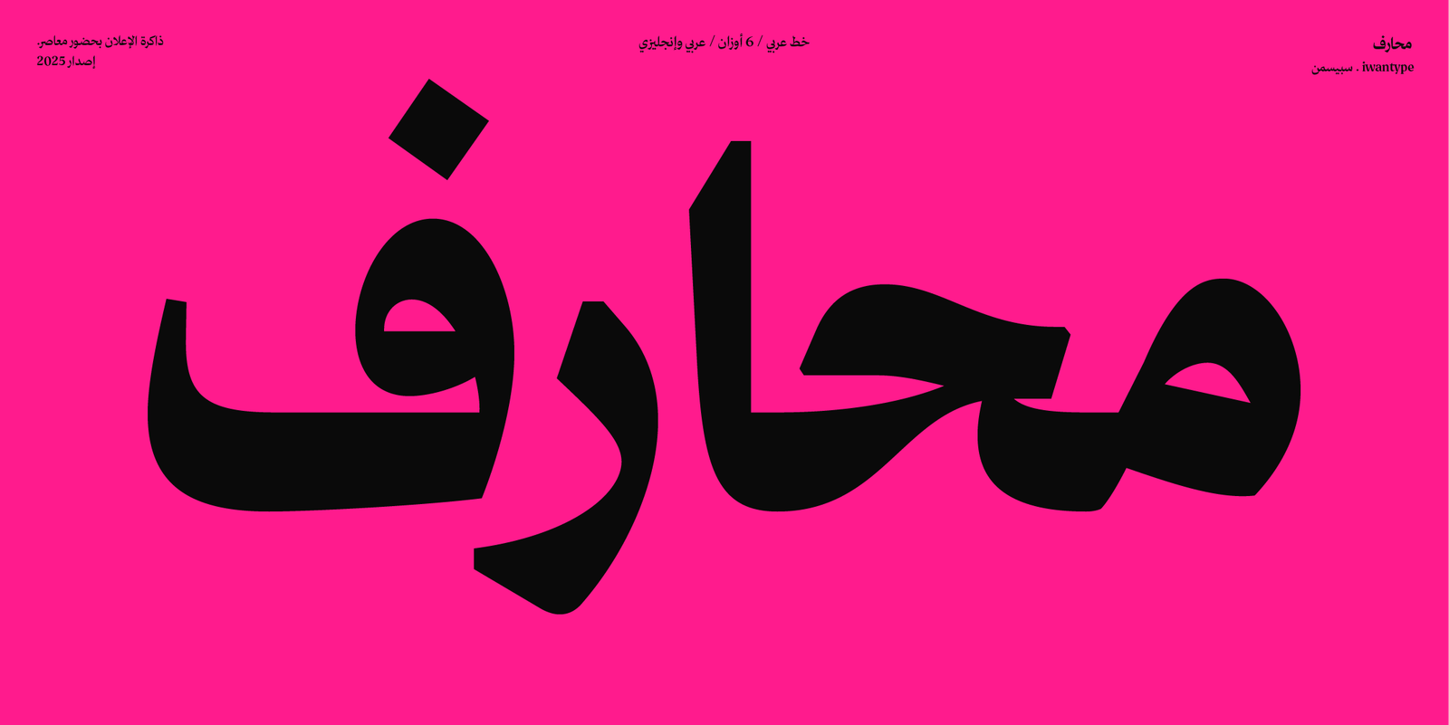
Maharif — a Naskh in Arabic and Latin, in six weights.

Ghroob — inspired by Naskh, with a simple, elegant design for graphics, print, the web and apps.
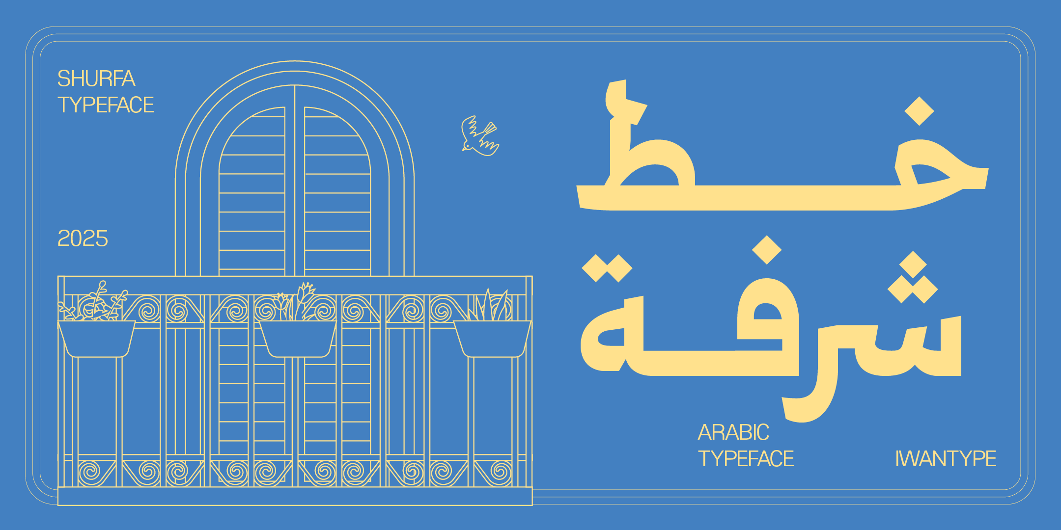
Shurfa — a Mastari Naskh inspired by the details of Thuluth, in seven weights from Light to Black.
🔖 Browse the collection
- Buying with a commercial license — what each license covers
- Naskh fonts — every Naskh typeface in the collection
- Modern Arabic fonts — the most contemporary designs in the collection
❓ Frequently asked questions
Traditional Naskh is built on the logic of the pen: stroke thickness that follows the angle of the reed pen, and extensions and ligatures that change with context. Modern Naskh rebuilds the same forms for the demands of print and screen: disciplined widths, a graded range of weights and simplified ligatures, so the typeface works in texts the calligrapher never knew.
Yes, and some Naskh typefaces are designed specifically for headlines. The difference is that a display typeface tends toward tighter counters and higher density, which is where its presence comes from. For long paragraphs it is usually paired with a text typeface, and the system is complete.
Type a sentence with full diacritics and watch how the marks stack up. Does the shadda collide with the fatha? Do the vowel marks run into neighboring letters? This test reveals the quality of a typeface faster than any description.
One thought on “Modern Arabic Naskh fonts: an Iwan Type guide”
Comments are closed.