


A headline is not body text set larger. A Naskh typeface that reads comfortably in a 200-word paragraph can look flat when you set two words in it at 60 px, and the reverse is just as true. This guide separates the two cases: first, what makes a Naskh typeface work for headlines; then 15 typefaces from the Iwan Type collection, grouped by the kind of headline rather than by taste.
What separates a headline typeface from a text typeface?
Both grow from the same Naskh roots; what differs is the treatment. Four properties settle it:
Contrast. The difference in stroke thickness between the vertical stems and the horizontal connections. The wider that difference, the more elegant a typeface becomes at large sizes and the more fragile at small ones, because the thin connection is the first part to weaken or break up. High contrast is neither a flaw nor a virtue in itself: it is a commitment to a particular size.
Counters. The enclosed spaces inside the letters. Open counters keep a letter legible at small sizes. Tight counters give a word mass and presence from a distance, but they do not automatically make the letters easier to tell apart, since the shapes can fill in at small sizes and long distances. That is why a typeface that looks “strong” on a sign can clog up in a paragraph.
Horizontal extensions. Alternate letters whose strokes are drawn out horizontally within the letter itself. These are known as swash letters, and you switch them on deliberately where you want them; they are not inserted automatically as a stretch between letters. An extension gives a word breadth and elegance, but it needs real width on the page and becomes a burden in a narrow column.
A range of weights. A single headline is rarely enough. You usually need at least three levels: a main headline, a subhead and a kicker. A typeface with seven weights gives you a complete hierarchy from one family, instead of borrowing levels from another typeface.
1. Presence you can see from down the street
These typefaces are built for presence. Their counters are tuned for mass rather than for the legibility of each individual letter, so they work where the distance is long or the time is short.
Anaween Anaween specimen — Show details
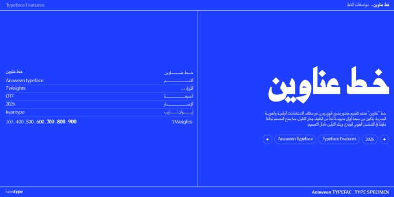 Anaween specimen — Show details
The name is Arabic for “headlines,” and that is its job: tall proportions and tight spacing from the tradition of newspaper and advertising type, for maximum visual density in the space available and more presence in less room. Its graded weights are enough to build a complete headline hierarchy from one family.
It shines in newspaper headlines, social media content cards, posters and book covers. If you need long body text alongside it, pair it with a text typeface and the system is complete.
MaharifMaharif specimen — Show details
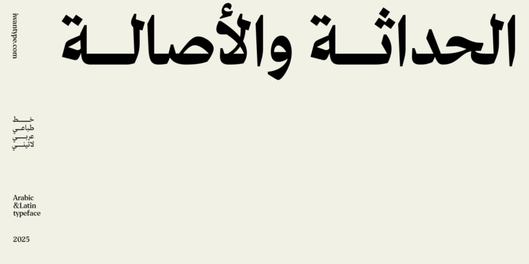 Maharif specimen — Show details
A bold presence with powerful heavy weights, in Arabic and Latin. The family has six weights.
Its natural territory is advertising, large posters and headlines that have to be seen before they are read, and few typefaces do that with as much force.
RayatRayat specimen — Show details
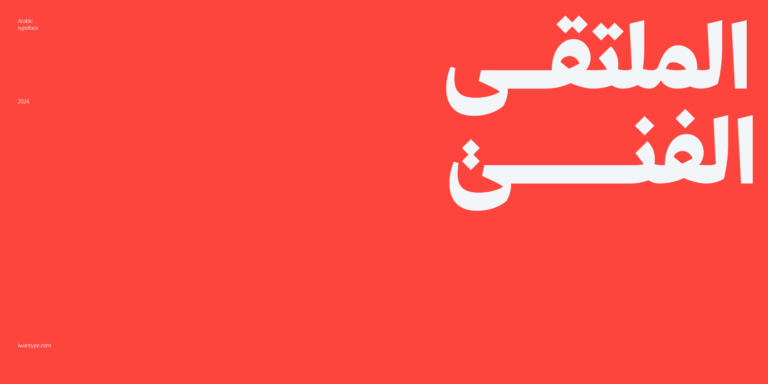 Rayat specimen — Show details
A modern Naskh with a sturdy structure and sharp angles that give it a bold character. Its counters are open, so the letters stay legible and easy on the eye, especially at large sizes. It supports both Arabic and Latin, with the Latin included in the full family only (the single weights and the 3-weight bundle are Arabic only). Its features include swash letters, alternate dots and a ya (ي) with a shorter descender that keeps the line even.
For prominent headlines and for brands that want a strong, contemporary character.
SomayaSomaya specimen — Show details
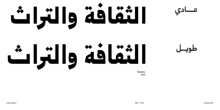 Somaya specimen — Show details
A modern Arabic Naskh that blends traditional and contemporary forms in harmony, in five weights.
For bold headlines, youth brands and contemporary cultural identities.
2. High-contrast luxury headlines
Here the luxury comes from the difference between thick and thin. All of these typefaces are at their best at large sizes, because that is where this difference shows, and it is the source of their beauty.
FatimaFatima specimen — Show details
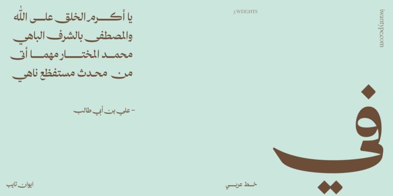 Fatima specimen — Show details
High contrast and distinctive proportions set it apart from traditional typefaces, and that is the trait that decides where it belongs. It comes with ligatures and stylistic sets, in five weights.
For magazine covers and premium editorial content, perfume and beauty identities, and upscale invitations. Production note: for printing on rough materials, embroidery or laser cutting, choose a heavier weight from the same family.
SalmaSalma specimen — Show details
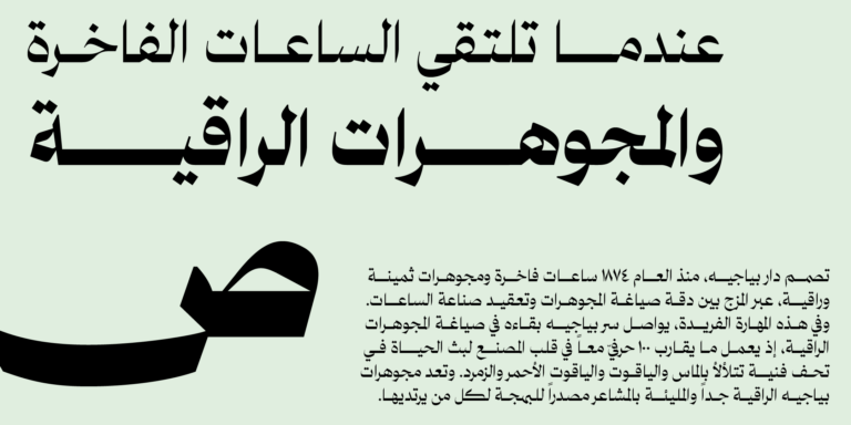 Salma specimen — Show details
Inspired by Mastari Naskh, with high contrast and newly drawn connections between letters that give it a striking beauty, in five weights.
For magazine covers and large headlines, fashion and real estate identities, and wordmarks.
AsalAsal specimen — Show details
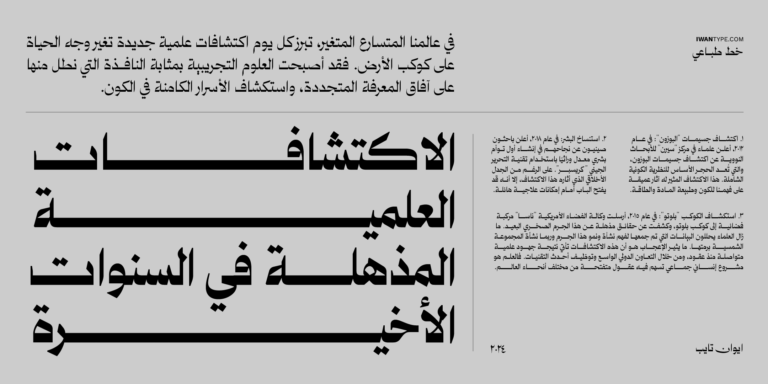 Asal specimen — Show details
Elegantly brings tradition and modernity together on a geometric foundation. It includes alternates and ligatures and comes in six weights.
For editorial headlines, contemporary cultural and heritage identities, and premium packaging.
Waha Waha specimen — Show details
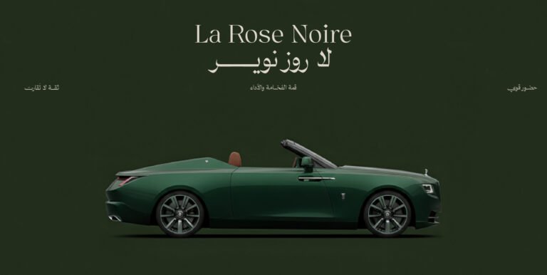 Waha specimen — Show details
A Naskh that carries the memory of vintage Arabic advertising. Inspired by the advertising Naskh that decorated products in the 1970s and 1980s, it balances classical purity with contemporary luxury through its long strokes and its elegance. The family has seven weights in Arabic and Latin, and its features include swash letters (celebratory extensions you switch on deliberately when you want them, not its default look) and a ya (ي) with a shorter descender that keeps the line even.
For brands, editorial headlines and luxury product design.
3. Quiet luxury: when you don’t want drama
Huwiya DisplayHuwiya Display specimen — Show details
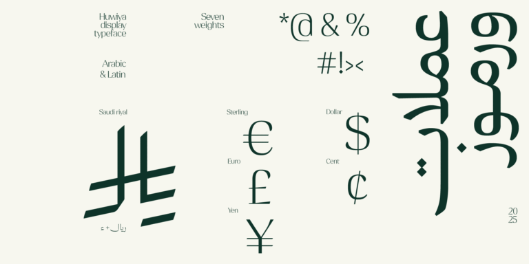 Huwiya Display specimen — Show details
Quietly luxurious, combining contemporary elegance with a classical touch: curves that lean toward the square and generous counters give it exceptional legibility. In Arabic and Latin.
For understated luxury identities, cultural institutions, print and catalogs, and bilingual content. Its calm is intentional, and that is its strength.
Rawasi DisplayRawasi Display specimen — Show details
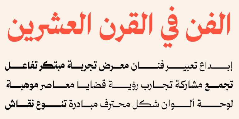 Rawasi Display specimen — Show details
Sharp edges and appealing contrast bring traditional and modern design together with a luxurious touch. It includes ligatures and comes in six weights.
For book and magazine covers, editorial headlines and the identities of long-established institutions.
4. Headlines with the spirit of a manuscript
DiwanDiwan specimen — Show details
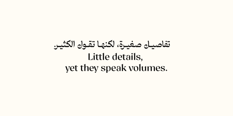 Diwan specimen — Show details
A contemporary Arabic typeface that skillfully blends the Naskh style with elegant touches of Diwani and Ruqaa, in a graded range of weights.
For book covers and literary magazines, cultural identities, invitations, and literary and poetic content.
5. Headlines that also work in short text
If you’re looking for one typeface that serves both headlines and text, start here.
WathiqWathiq specimen — Show details
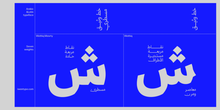 Wathiq specimen — Show details
An Arabic–Latin typeface inspired by Naskh with touches of Thuluth: strong letters and tight counters, in seven graded weights built to one consistent standard across the whole family.
For corporate and commercial identities, headlines, interfaces and medium-length text.
GhroobGhroob specimen — Show details
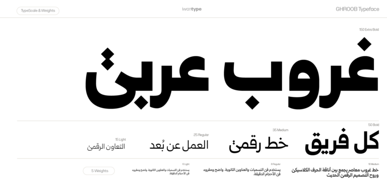 Ghroob specimen — Show details
Inspired by Naskh, with a simple, elegant design, in five weights.
For headlines, posters, contemporary brand identities and packaging.
ZajelZajel specimen — Show details
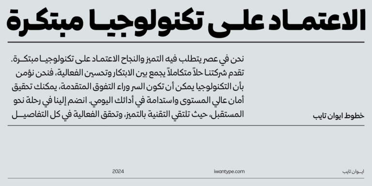 Zajel specimen — Show details
An elegant modern Naskh whose contemporary design combines angles and curves. It has OpenType features, supports Arabic and Latin, and comes in five weights.
For headlines, digital content, contemporary identities, interfaces and medium-length text.
6. Friendly headlines
Rayat RoundRayat Round specimen — Show details
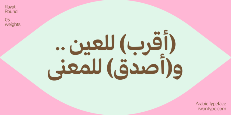 Rayat Round specimen — Show details
Soft, rounded terminals add a warm, human character to a geometric structure while keeping it legible and balanced, in five weights.
For food, beverage and confectionery brands, children’s and educational products, family events, and apps that want to feel easy to use.
How to choose in three steps
- Pin down the smallest size the typeface will actually appear at, not the largest. It is the smallest use that breaks a typeface, not the biggest.
- Ask: will it be used for headlines only, or for headlines and text? If it’s the second, go straight to section 5: its typefaces cover both cases with a single family.
- Test it on the longest word in your project, not on a sample word. Long and compound names are what expose tight counters and crowded dots.
You can also try any typeface on your brand name before you buy, right on its font page.
Frequently asked questions
The roots are the same; the treatment differs. A display typeface tends toward higher contrast, tighter counters and longer extensions, so it gains presence at large sizes and loses legibility at small ones. A text typeface reverses that: gentler contrast, more open counters and a more even rhythm.
Some, yes. In this guide, Wathiq, Ghroob, Zajel and Rayat work in medium-length text, and Asal works in its middle weights only. Fatima, Salma, Maharif and Diwan put all their strength into the headline, and the best thing you can do with them is pair them with a text typeface from section 5. That gives you a two-layer system: a headline that catches the eye, and text that is easy to read.
Three is a practical minimum: one each for the main headline, the subhead and the kicker. The seven-weight typefaces in this guide (Anaween, Huwiya Display, Wathiq and Waha) give you that hierarchy from a single family.
In its original sense, kashida is an elongation of the connection between two letters, used to justify lines of text. What these typefaces have is a drawn extension: an alternate form drawn by the designer and switched on deliberately, with its own drawn shape and a carefully considered terminal. The precise name matters because it defines what you are asking of the typeface.
Usually not. Twelve of the fifteen typefaces in this guide come with a Latin companion designed alongside the Arabic. There are only three exceptions, Asal, Fatima and Somaya: if your project is bilingual, you will need to choose a Latin typeface to go with them yourself. Note that Rayat, Rayat Round and Diwan include the Latin in the full family only (their single weights and 3-weight bundles are Arabic only), and Rawasi Display is sold in two versions, Arabic and Arabic + Latin. Check each font page to see exactly what the files include.
One thought on “Naskh fonts for headlines: 15 typefaces and which one suits which headline”
Comments are closed.